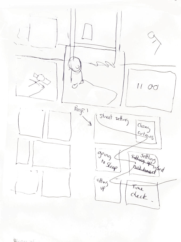
Categories
Coursework Research Points, Part Three: Making

Research task: ​Paper Toys

Brief

Paper toys are essentially what their name suggests; they are toys made of paper. Find some specific artists who design paper toys and document examples of their work in your log. What is the purpose of paper toys? Who is their target audience? What is the draw to making paper toys as opposed to buying pre-made toys?

Visual Skills 2: Visual Exploration p106

Keywords from the brief

  • Find some specific artists who design paper toys and document examples of their work in your log
  • What is the purpose of paper toys?
  • Who is their target audience?
  • What is the draw to making paper toys as opposed to buying pre-made toys?

Seth

The first artist I examined was Gregory Gallant, a Canadian cartoonist better known by his cartoon name Seth. After seeing a few documentaries and reading about him, I realised that he is an artist who frequently writes graphic novels on the ordinary issues of life, such as people attempting to determine whether their lives have been successful.

Here’s one of the documentaries I watched in which he talks about his artworks. His large collection of projects caught my interest because he not only does commission work, but he also explores a variety of other artistic interests for personal enjoyment. These include a rubber stamp diary, a sketchbook, and he is developing a model city called The City of Dominion.

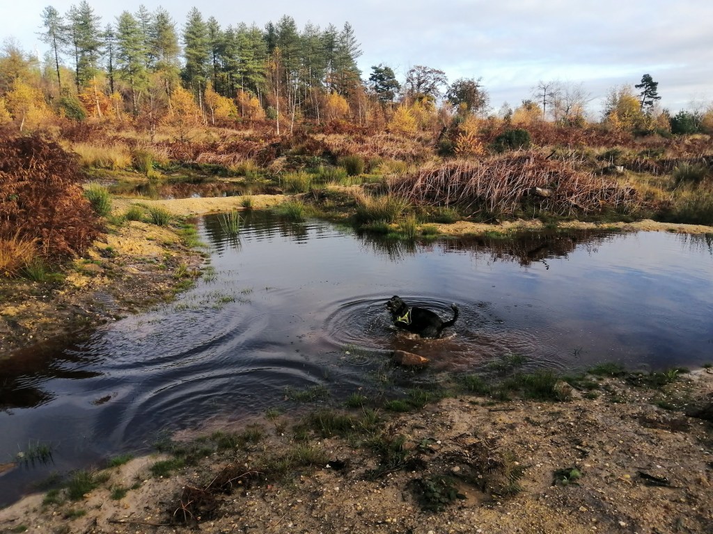
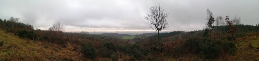
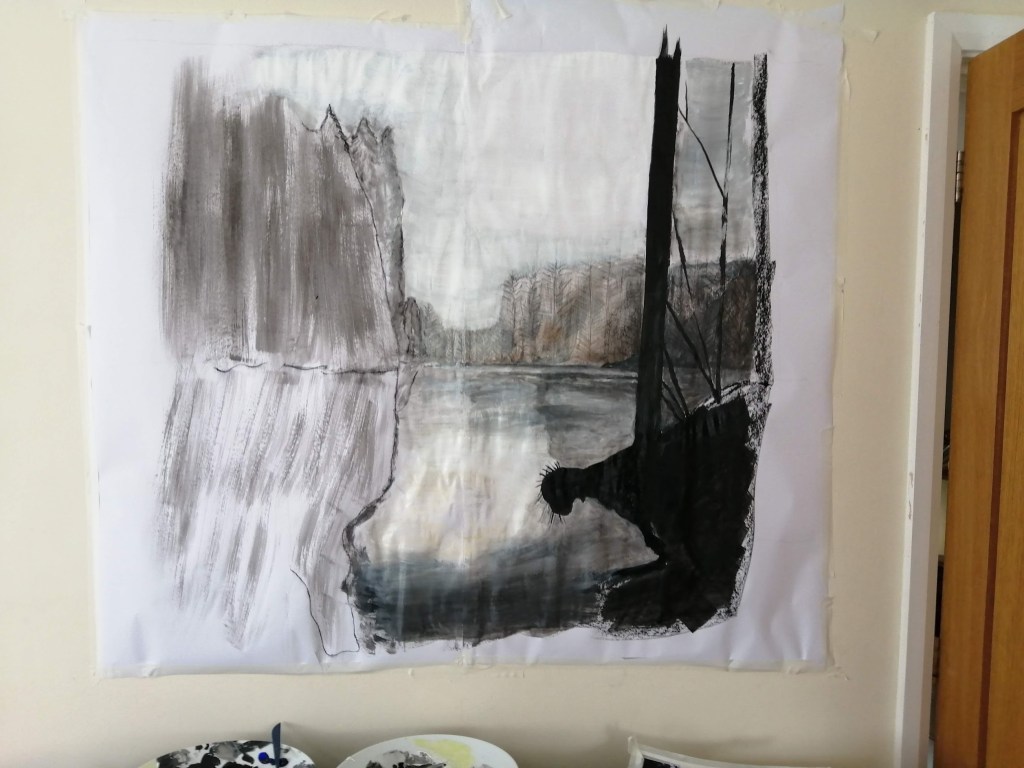
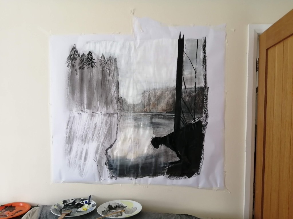
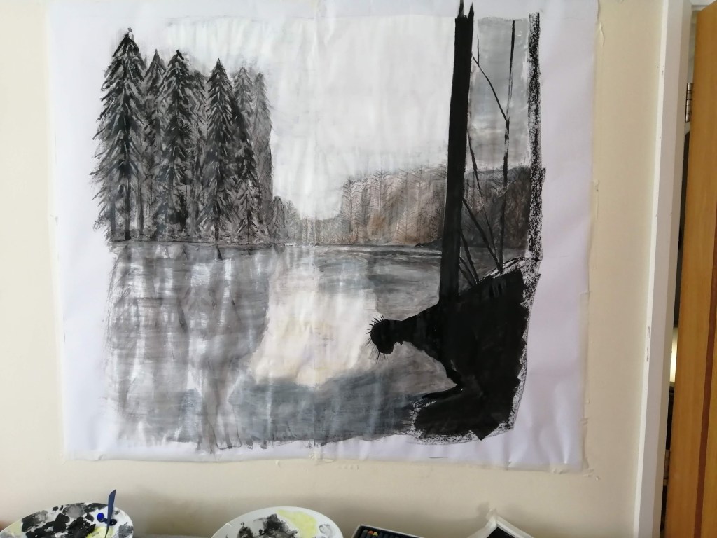
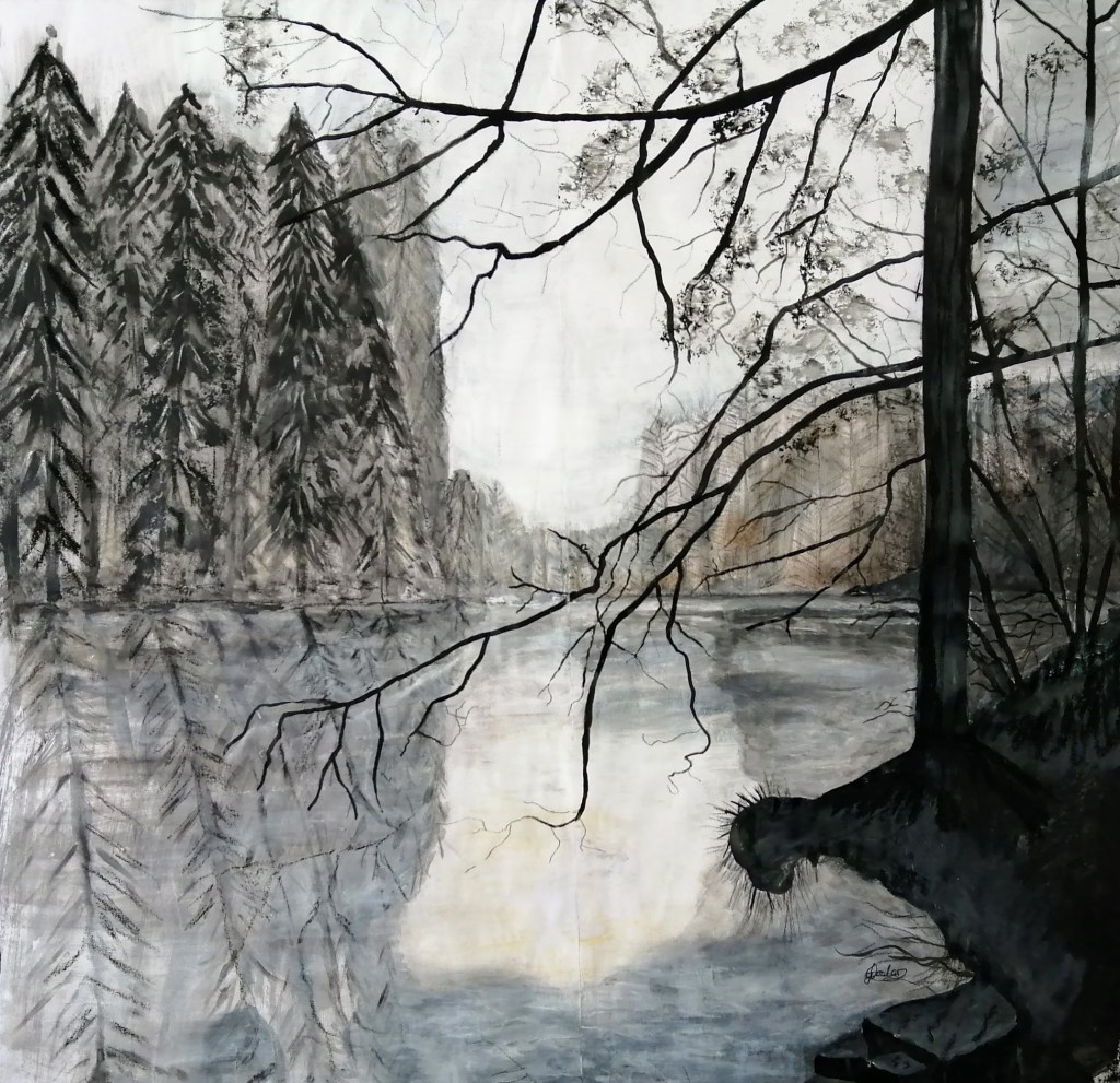
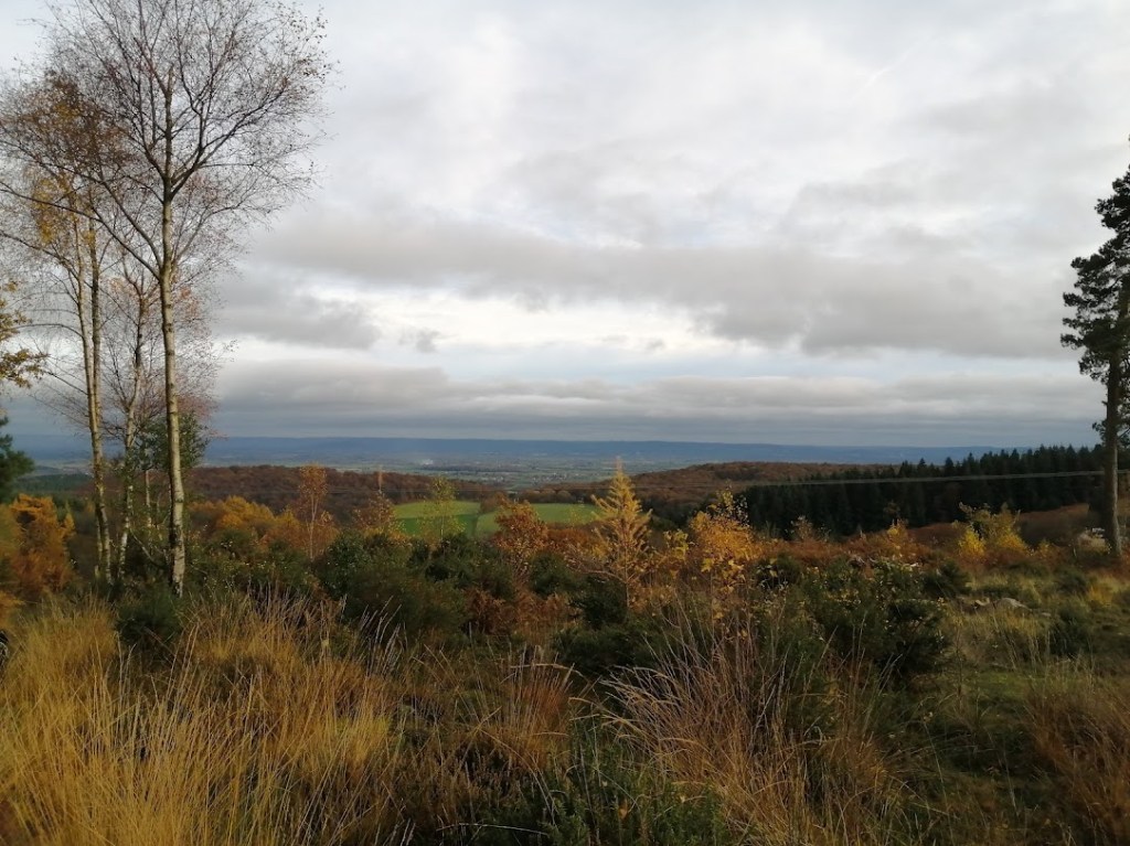
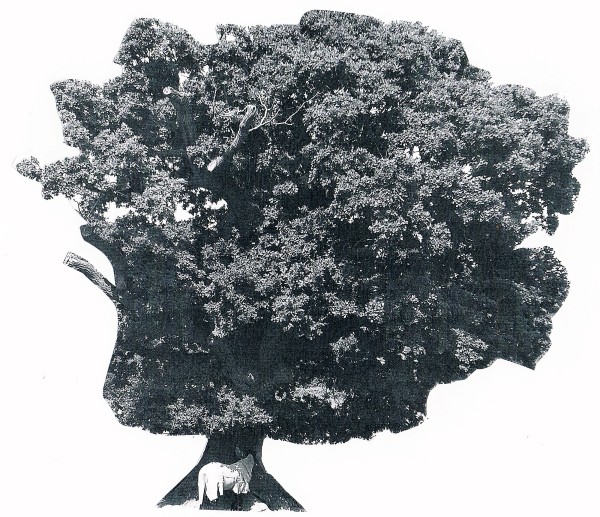
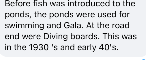
Throughout the documentary, I enjoyed his short animated film called The Creek. It reminded me of a local site called Soudley Ponds. In the 1930s and 1940s, villagers used man-made diving boards to swim during hot summer days. Today, however, it is a nature reserve full of fish and crayfish, as well as a place where people may take a stroll and view the stunning scenery.

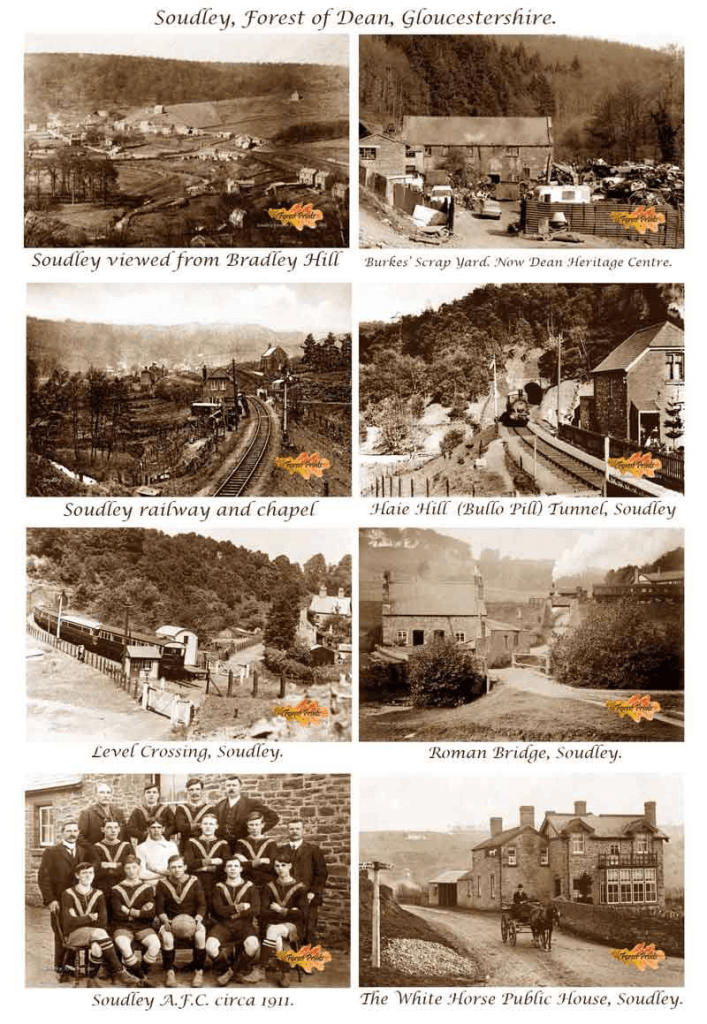
I wanted to post a photo of people swimming in the ponds, but couldn’t find one. However, I was able to find some old images of the surrounding area and a woman describing what it used to be like on Facebook.

Fig. 1 Facebook post (2017)
Fig. 2 Old photos of Soudley village. (2017)

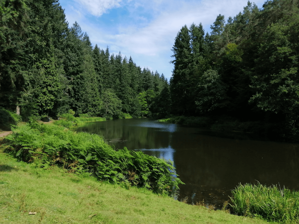
Below is an a photograph I took recently of Soudley ponds.

Fig. 3 Soudley ponds (2024)

Reflecting on Seth’s work, I think he is so successful because of his sheer determination and he is alway developing his artistic practice. Also, his written storytelling is as good as his artwork, which brings emotional depth to his graphic novels. The combination of the two enhances the overall storytelling experience. Looking at his artistic technique, he employs clean lines and a muted colour palette to create a vintage feel to his work.

Steve Monger

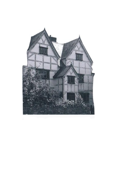
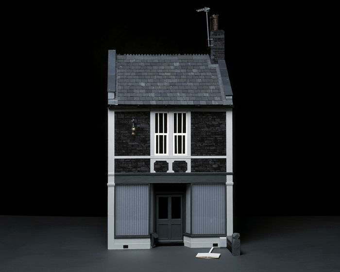
The next artist I have the pleasure of researching is one of my former tutors from one of my previous units at the OCA.  Not only is he an OCA tutor, but also a Graphics and Senior Lecturer at Bristol University. In his spare time, Stephen investigates photographic representations of location and is particularly interested in how photography might overlap and merge with other types of representation such as digital drawing and 3D modelling.

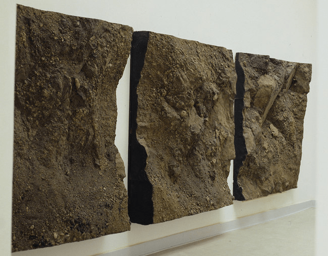
This leads me to the model making of buildings Stephen has produced using cardboard. Although part of his work included photography he also created many sculptures of building to show the viewer the different details that was otherwise inaccessible by the use of photography alone. Below are some photographs of one of these paper sculptures.
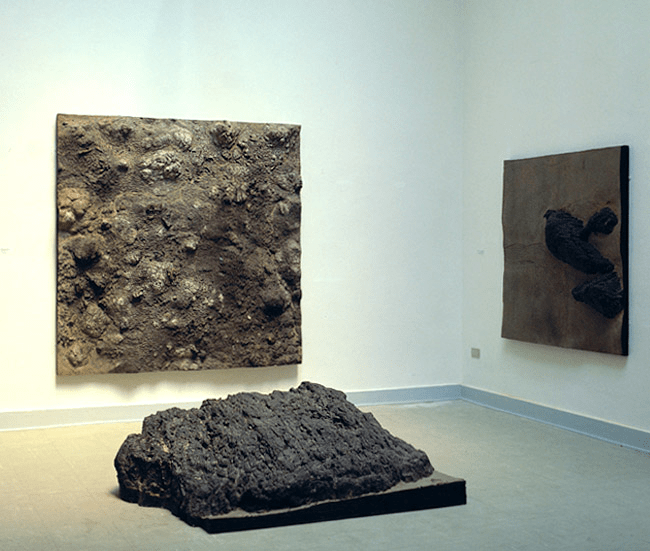
Fig.4 The making process of Pawnbroker (2008)
Fig. 5 The Pawnbroker (2008)

Thomas Demand

Similarly to Stephen, Thomas is a an artist who also builds realistic models of buildings. However, these are life-sized models of spaces and buildings using a selection of paper and cardboard. Interestingly, he then photographs these models and after destroys them so the photograph is the only record left.

Below is an interesting documentary I watched about Thomas’s work.

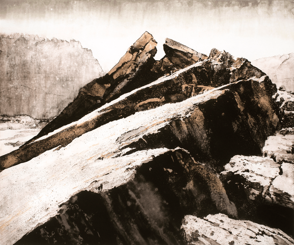
After watching it I was quite amazed at the sheer dedication and detail he puts into his art work, often taking weeks to construct them. What sets his work apart from other artists is not just the craftsmanship but also the depth of meaning within each piece. One example is called “Yellowcake”.

For this project, Thomas meticulously reconstructed the scene of the 2001 event involving the Embassy of the Republic of Niger in Rome, using paper and cardboard. It was at the Embassy information regarding Saddam Hussein’s alleged attempt to purchase uranium “yellowcake” was stolen.

Below is one of the photographs of his reconstruction.

Fig. 6 ‘Lemoncake’ (2007)

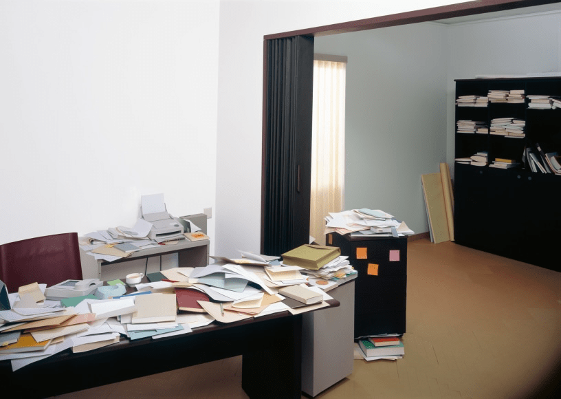
Through Demands craftsmanship and series of photography he invites viewers to think about the narrative and subsequent consequences of the event, which was the invasion of Iraq by the U.S. The fact that the alleged proof of Saddam’s attempt was later revealed to be forged adds a sense of tragedy to the narrative.

Looking at Demand’s interpretation of this event through his artwork offers people a different kind of engagement compared to a brief news report. I personally find it more thought provoking, intimate and memorable.

Amy Bennett

The final artist I researched is Amy Bennett, an American artist who has a unique approach when creating narrative paintings. This consists of constructing paper models and using them as reference material to observe and paint from. She often uses these models to create detailed and surreal scenes that explore themes of suburban life. By using these paper models, Bennett can explore different viewpoints and compositions before starting her painting. 

Each painting shows a different aspect of everyday life in a way that is both familiar and thought-provoking. In the video I watched below she states ” It’s a bit like being a fly on the wall, observing people and their interactions without them knowing.” (Bennett, 2011). This gives her paintings a vulnerability that is both captivating and intimate.

As a mother and wife, she has used the many challenges this brings, as well as the joys of life, as inspiration for her artwork. This can be seen in her work called “Nuclear Family,” which captures the complexity of love and relationships as well as the difficulties of family struggles. 

Below is a photograph of one of the paintings from the series “Nuclear Family.

Fig. 7 Animals (2018)

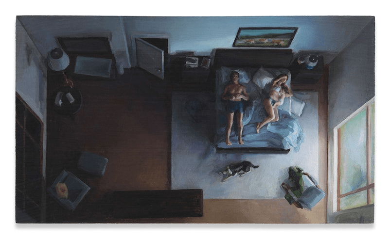
Her artistic style often features bold colours, abstract shapes, buildings and people. These elements combine to create a unique and engaging image. Looking at these works reminds me of my own experiences as a mother and wife and has prompted me and I should think others to reflect on everyday life.

What is the purpose of paper toys?

The purpose of paper toys is to provide entertainment and creative expression for children and adults alike. Not only is it easily accessible but as shown in this research task it also allows for endless creative possibilities.

Who is their target audience?

It depends on the artist who is making the paper toys and their intention for them. The target audience could be any age. It could be designed for pure enjoyment. On the other hand, the target audience might be to engage viewers in a political or cultural matter. To spread important messages and spark conversations. The artist may also aim to promote social change and awareness through their work.

What is the draw to making paper toys as opposed to buying pre-made toys?

There are many benefits to making paper toys, which are: 

  • The pure satisfaction of making something with your own hands that can be played with or explored.
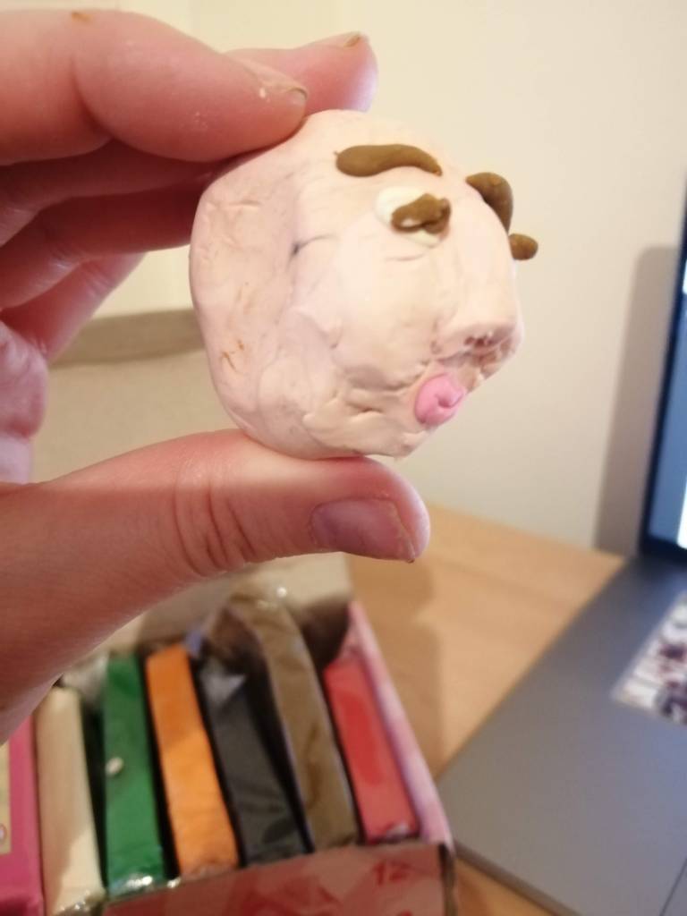
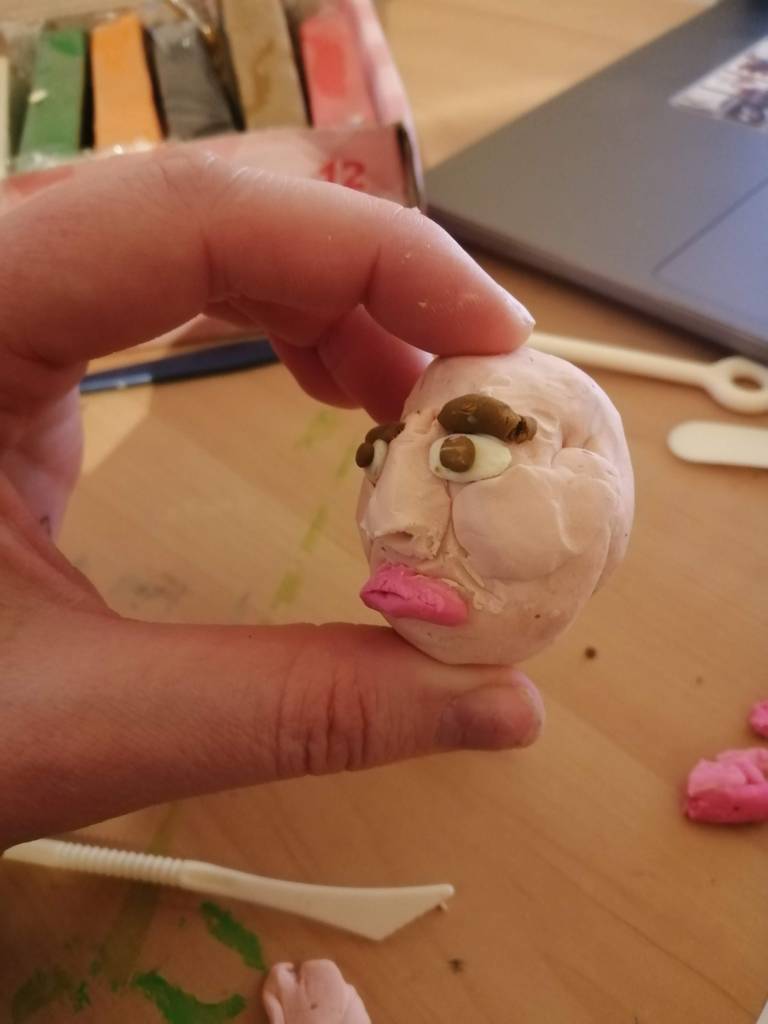
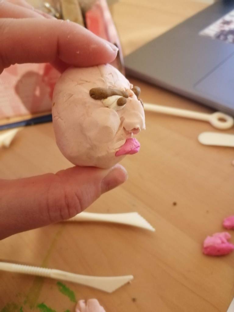
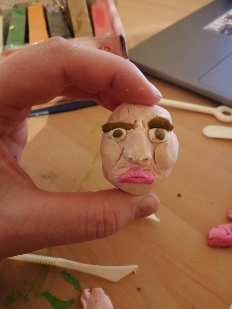
  • Making paper toys allows for customisation and creativity in design, as discussed in Amy Bennett’s research.
  • From an environmental perspective, paper toys are more sustainable than plastic alternatives and can be easily recycled at the end of their life cycle.
  • Personally I would appreciate a handmade paper toy skilfully made, more than a bought plastic toy because to me it would hold more sentimental value.
  • In some cultures paper toys hold significance values for example the long-standing tradition of origami that originating from Japan.

References

Bennett, Amy. “Amy Bennett.” Www.amybennett.com, 2021, http://www.amybennett.com/home.html.

Bennett, Amy . “Artist Amy Bennett.” Www.youtube.com, Anthony Paget , 26 July 2011, youtu.be/yodJPR5hGic. Accessed 28 Mar. 2024.

Brownstein, Bill. “Film Animates the Life of Comic Book Creator Seth.” The Gazette, Bill Brownstein, 8 Oct. 2014, montrealgazette.com/entertainment/arts/film-animates-the-life-of-comic-book-creator-seth. Accessed 26 Mar. 2024.

Chamberland, luc. “Seth’s Dominion.” Www.youtube.com, 13 Mar. 2024, youtu.be/EJMKBiJuO6I. Accessed 28 Mar. 2024.

Demand, Thomas . “Thomas Demand: Animations | Exhibition | DHC/ART.” Www.youtube.com, 18 Jan. 2013, youtu.be/M-itI67quhE. Accessed 28 Mar. 2024.

Hoffman, Eric, et al. Seth: ConversationsPerlego, University Press of Mississippi, 4 Feb. 2015, http://www.perlego.com/book/561986/seth-conversations-pdf. Accessed 28 Mar. 2024.

kurkdjian, guillaume. “Amy Bennett.” Wertn.com, 22 May 2019, wertn.com/2019/05/amy-bennett/.

Maher, Daniel. “Amy Bennett Looks at the Complexities of Suburban Family Life in Her Miniature Paintings.” Www.itsnicethat.com, 10 Apr. 2019, http://www.itsnicethat.com/articles/amy-bennett-nuclear-family-art-100419. Accessed 28 Mar. 2024.

Monger, Stephen. “About : Stephen Monger.” Www.stephenmonger.com, 1995, http://www.stephenmonger.com/index.php/info/about/. Accessed 28 Mar. 2024.

—. “Mr Stephen Monger – UWE Bristol.” People.uwe.ac.uk, people.uwe.ac.uk/Person/StephenMonger. Accessed 28 Mar. 2024.

Shane, Robert R. “Amy Bennett: Nuclear Family.” The Brooklyn Rail, 4 Sept. 2019, brooklynrail.org/2019/09/artseen/Amy-Bennett-Nuclear-Family. Accessed 28 Mar. 2024.

Tylec, Laurie . “Acquisition: Thomas Demand “Embassy I,” from the Series “Yellowcake.”” Www.nga.gov, 30 Oct. 2020, http://www.nga.gov/press/acquisitions/2020/demand.html. Accessed 26 Mar. 2024.

Wehr, Anne. “Thomas Demand.” Frieze, 1 Apr. 2008, http://www.frieze.com/article/thomas-demand-1. Accessed 28 Mar. 2024.

Illustration list

Fig. 1 Facebook post (2017) [Facebook, screenshot] At:https://www.facebook.com/ForestBygoneHistory/photos/a.10150369899392595/10154391365347595/?type=3 (Accessed 26/03/2024).

Fig. 2 Old photos of Soudley village. (2017) [Facebook, screenshot] At:https://www.facebook.com/ForestBygoneHistory/photos/a.10150369899392595/10154391365347595/?type=3 (Accessed 26/03/2024).

Fig. 3 Fowler, G. (2024) Soudley ponds [Photograph, landscape] In possession of the author: Forest of Dean.

Fig.4 Monger, S. (2008) The making process of Pawnbroker [Paper sculpture] At: http://www.stephenmonger.com/index.php/the-prawnbroker/ (Assessed 26/03/2024).

Fig.5 Monger, S. (2008) The Pawnbroker [Paper sculpture] At: http://www.stephenmonger.com/index.php/the-prawnbroker/ (Assessed 26/03/2024).

Fig. 6 Demand, T (2007) Lemoncake [Paper sculpture] At: https://www.303gallery.com/gallery-exhibitions/thomas-demand?view=slider#7 (Accessed 25/03/2024)

Fig. 7 Bennett, A (2018) Animals [Painting] At: www.itsnicethat.com/articles/amy-bennett-nuclear-family-art-100419. (Accessed 26/03/2024).

Categories
Coursework Part Three: Making

Exercise 3:​ Big

There were three options for this exercise, I chose option one, which was to produce a very large-scale drawing of a landscape.

Brief

For this option you should produce at least one very large-scale drawing of a landscape, either real or imagined. This should be at least A0 (84 x 119cm) in size (and ideally larger) either by sourcing some very large sheets of paper, or a roll of paper, or by taping a number of sheets of paper together.

You can choose to produce an observational drawing of a landscape or you can produce an imagined landscape using more abstract marks. You can use pencils, brushes and ink, or any mark-making implements using the medium of your choice.

Visual Skills 2: Visual Exploration: p95

Keywords from the brief

  • Produce a very large-scale drawing of a landscape real or imagined.
  • At least AO
  • You can use pencils, brushes and ink, or any mark-making implements using the medium of your choice.

There were a number of places I had in mind for this landscape project. Luckily, living in the Forest of Dean I am surrounded by stunning scenery. With this in mind, I ventured out on a walk and took photo’s of areas I thought would make a beautiful painting.

Below are photos from my walk.

Fig. 1 Edgehills Bog (2024)
Fig.2 Edge hills view point (2024)
Fig. 3 The Cyril Hart Arboretum (2024)
Fig. 4 Old oak tree (2024)
Fig. 5 Working forest, logs (2024)
Fig. 6 Speech House lake (2024)

During a research task titled Large Scale Image-making, I looked into various artists and how they used different materials and their unique approach to large- scale image making, This inspired me to be more experimental with the materials I decided to use for my own making. One of the artists previously researched, is John Vertue. This artist is recognised for his large-scale landscape paintings in black and white. With him in mind, I chose the final photograph above because it was in black and white and used it as a reference for my landscape painting.

Unfortunately, I am located in a small village with limited amount of shops and sadly, there are no local art suppliers. Knowing I would need good quality paper for this exercise I drove twenty five miles to my nearest Hobby Craft. Here, I purchased two A1 mixed media pieces of paper and some acrylic paints. Once, home I was eager to start work but was apprehensive because the paper is so large. I didn’t know where to put it, I considered putting them on the floor, but I didn’t think it would help with getting the scale correct and I thought the work may get damaged either by my pet dogs or children.

Instead, I taped the paper together using masking tape and then tapped it to my lounge window.

Fig. 7 Landscape painting set up 1 (2024)

Next, I began making swift marks with flowing motions from the whole use of my arm.

Fig. 8 Mark making (2024)

Sadly, the paper wouldn’t stay stuck to the window and the sunlight started to shine through making it difficult to see the work. Thinking about this more I took the paper down from the window and placed it on my drawing table in the other reception room. Continuing to work I regretted making such large dark brush strokes so soon and wasn’t happy with how the work was going. Therefore, I decided to leave the image and start again.

Fig. 9 Failure (2024)

However, I showed it to a family member, laughing at how bad it was and was surprised that they actually liked it and said they knew the place of which I was painting. This made me feel a little better and more confident to start again. Unfortunately, I no longer had good quality paper and had to settle with what I had in the house, which was a roll of printing paper. This time I cut the paper to size again taping two pieces together and stuck it to the playroom wall using masking tape.

Fig. 10 New paper, staring again (2024)

This time I was a little more cautious and decided to lightly sketch out a plan for the painting. Once all the landscape was planned out I began painting.

The mediums used to create the landscape painting were:

  • Acrylic paint
  • Selection of sponges
  • Charcoal
  • 2B pencil,
  • Pencil crayons
  • Chalk pastels
  • Oil pastels.
  • My finger
  • Different size brushes
Fig. 11 Painting process one (2024)
Fig 12. Painting process two (2024)
Fig 13. Painting process three (2024)
Fig 14. Painting process four (2024)
Fig 15. Painting process five (2024)

Final painting

Fig 16. Finished landscape painting of Speech House Lake (2024)

Reflection

What did you find most challenging?

There were a number of things I found challenging about this project. These were:

  • Working at a large scale (100cm x 100cm) and trying to figure out how to scale up each element correctly.
  • Using my house’s wall to place the sheets of paper was not ideal, and as my husband pointed out, it would not be advisable to do so again due to the marks left behind by charcoal dust. However, I was fine with using the wall because it was time for redecorating anyhow.
  • Working on thin sheets of paper was also problematic as it wasn’t a good choice when using mixed media. If I was to do this again I would make sure I purchase more of the mixed media sheets of paper incase of mistakes.
  • The photo I used for reference was not very good quality, so a lot of the painting I had to imagine and interpret in my own way. If I was to do this again I would either like to draw from life or have a better quality photograph.
  • Last but not least, I have never drawn or painted a natural environment other than a sea scene, thus this was the most difficult challenge of them all!
  • What made it even more difficult was trying to interpret the different elements in monochrome.

Is this an area of art practice that you have worked with before?

There has only been one time I have worked at a very large scale and that was twenty years ago when I worked for an aquatic shop as a tropical fish manager. At the time my boss wanted the shop to have a mural so I offered to paint it for him. This was a very large landscape scene, that showed rolling hills and rivers and covered the whole back wall of the shop. Unfortunately, they refurbished and extended the shop since then and it no longer exists. Sadly, I do not have any photographs of it anymore.


Would you attempt this again and, if so, how would you change or develop your approach?

Yes I would attempt this again. It was fun to be experimental and paint a landscape scene. I was quite surprised at the work I produced since it is my first time painting trees. Although it is not perfect, I am going to have it printed and framed to hang in my studio.

As said before, if embarking on a project like this again I would make sure I have quality paper and good reference photographs.

List of illustrations

Fig. 1 Fowler, G (2024) Edgehills Bog. [Photograph, landscape] in possession of: the author: Forest of Dean.

Fig. 2 Fowler, G (2024) Edge hills view point. [Photograph, landscape] in possession of: the author: Forest of Dean.

Fig. 3 Fowler, G (2024) The Cyril Hart Arboretum [Photograph, landscape] in possession of: the author: Forest of Dean.

Fig. 4 Fowler, G (2024) Old oak tree [Photograph, Portrait] in possession of: the author: Forest of Dean.

Fig. 5 Fowler, G (2024) Working forest, logs [Photograph, landscape] in possession of: the author: Forest of Dean.

Fig. 6 Fowler, G (2024) Speech House Lake [Photograph, landscape] in possession of: the author: Forest of Dean.

Fig. 7 Fowler, G (2024) Landscape Painting set up 1 [Photograph, landscape] in possession of: the author: Forest of Dean.

Fig. 8 Fowler, G (2024) Mark making [Photograph, landscape] in possession of: the author: Forest of Dean.

Fig. 9 Fowler, G (2024) Failure [Photograph, landscape] in possession of: the author: Forest of Dean.

Fig. 10 Fowler, G (2024) Failure [Photograph, landscape] in possession of: the author: Forest of Dean.

Fig. 11 Fowler, G (2024) Painting process one [Photograph, landscape] in possession of: the author: Forest of Dean.

Fig. 12 Fowler, G (2024) Painting process two [Photograph, landscape] in possession of: the author: Forest of Dean.

Fig. 13 Fowler, G (2024) Painting process three [Photograph, landscape] in possession of: the author: Forest of Dean.

Fig. 14 Fowler, G (2024) Painting process four [Photograph, landscape] in possession of: the author: Forest of Dean.

Fig. 15 Fowler, G (2024) Painting process five [Photograph, landscape] in possession of: the author: Forest of Dean.

Fig. 16 Fowler, G (2024) Finished landscape painting of Speech House Lake [Photograph, landscape] in possession of: the author: Forest of Dean.

Categories
Research Points, Part Three: Making

​Research Task:​ Large Scale Image-Making

Brief

For this research task, I have been asked to look at a one-day conference called ‘The Embodied Experience of Drawing’, held in 2018, in Plymouth. After, I was asked to make some notes about the participants different drawing techniques and physical processes.

To do this, I watched a short video that observed the participants drawing and took screenshots of people’s different approaches.

Here’s a picture of one of the conference women, lying on her back. Taking different pens and pencils and making marks on the page without looking at it. The marks made will be limited by the extension from her elbow upwards.

Approach one

Fig. 1 Drawing approach one extension of elbows (2018).

The next image, is the same approach as above but allows a full extension from the shoulders into both arms. This creates a more flowing line work, especially with the medium charcoal as it makes bold expressive lines.

Fig. 2 Drawing approach one, full extension of arms (2018).

Approach two

With the next approach, this lady is sitting looking at the paper on her knees. Again using charcoal but this time using the motion of her arms to swish back and forth in front and behind her.

Fig. 3 Drawing approach two, drawing kneeling (2018) [vimeo, screenshot] At https://vimeo.com/267261033# (Accessed 13/03/2024).

Approach three

In the next image, the lady is making marks by creating rubbings from various surfaces.

Fig. 4 Drawing approach three, rubbings (2018).

Approach four

In the next two images, the participants are using their whole bodies to create marks with what I think is graphite powder. This is a more physical approach than the previous ones and will make the most expressive marks.

Fig. 5 Drawing approach four, whole body 1 (2018).
Fig. 6 Drawing approach four, whole body 2 (2018).

Approach five

Finally, many artists were practising their observational skills by drawing still lifes.

Fig. 7 Drawing approach five, observation (2018).

From watching the video, I can see the purpose of the day was to explore the relationship between drawing and using various parts of the body or the whole body. It would be a beneficial exercise that will help to explore new ways of approaching drawing.

Next, I was asked to search for and record my thoughts on some of the listed artists in the OCA textbook who make large-scale images.

The following artists from the textbook appealed to me:

  • Emma Stibbon
  •  John Vertue
  • The Boyle Family

Emma Stibbon

Before starting the previous exercise, which was to create a large landscape scene, I began first, with this research task. One reason I selected Emma, is because Emma is a British artist known for her large-scale drawings and prints that often depict dramatic landscapes and environmental events. This is therefore an appropriate research task before embarking on the previous exercise and I thought I may find inspiration from Emma’s work.

Stibbon has visited remote and environmentally significant places all over the world, such as Antarctica, the Arctic, Iceland, and volcanic regions. Emma creates reference sketches of these natural landscapes, glaciers, volcanoes and polar regions while on location, which she then refers to when creating her finished pieces in her studio. The drawings and prints serve as visual records of her observations and encounters whilst on her expeditions. As she states on her website,

Many of the environments and landscapes I depict are changing rapidly. As an artist, I feel committed to representing the impact of these changes, be they natural or human. My impulse is to draw, in an effort to act as a witness.” (Stibbon, n.d.)

Stibbon’s drawings and prints are full of detail and powerful compositions. She often works in monochrome, using charcoal, graphite, ink, and other media to create intricate pictures.

Her creations evoke awe; they make me feel as though I’m there, experiencing the moment she has captured.

John Vertue

John Virtue, is a contemporary British artist, known for his distinctive monochromatic landscape paintings, primarily in black and white. Many of his large-scale works consist of dramatic landscapes, often depicting urban scenes, coastal views, and rural landscapes.

Researching online, I found a very interesting documentary where Virtue discusses the makings of his artworks.

(The Culture Show: John Virtue, 2012)

He explains his work consists of abstract compositions from the way he perceives the world. In order to do this he is very experimental with the materials he choses to use, such as many different types of brushes, rags, his own hand, black ink mixed with shellac and titanium acrylic. (Virtue, J, 2012)

His artworks consist of bold brushwork, strong contrasts, and are full of movement and energy. What I find interesting about his work is there is a powerful sense of atmosphere and mood even without the use of colour.

Below are some examples of his work.

The Boyle family

The Boyle Family is a group of artists consisting of Mark Boyle, Joan Hills, and their children Sebastian Boyle and Georgia Boyle. It began originally with the mother and father in the early 1960s, when they started to visit demolition sites in London and gathered materials to use in their artwork.

To get a better understanding of who the family are and their artistic approaches I watched the following documentary.

(‘Boyle Family’ documentary, 2015)

The documentary is very informative and is interesting to see the artist’s approach and visions for their works and the many different projects they have embarked upon. It was also interesting to hear the objective of the works, Mark said :

The objective is to teach ourself to see“.

I found this statement quite thought provoking as an artist myself, this is what I constantly strive to do, to see exactly what is in front of me and portray it to the viewer as I would like them to see it.

The Boyle Family, all have an innovative approach to art-making, which involves the replication of real-life surfaces and landscapes. They are particularly renowned for their “Earth Studies” series, where they recreate sections of the Earth’s surface in three-dimensional relief, capturing the texture, composition, and detail of specific locations.

Fig.8 Bergheim Mine Study (1974)
Fig.9 Rock and Scree Series (1977)

Another study which I found interesting is called “The Multi Human Being series”. Which was the study of different parts of the body. Mark himself took top layers of skin from different parts of his body and then created images from them using a projector.

Fig. 10 Skinchart for Body Work (1969)
Fig. 11 Skin Series, Left Heel Study (1969)
Fig. 12 Skin Series, Small Back Study (1973)

Overall, I find their work challenges traditional notions of what constitutes art and encourages viewers to reconsider their perception of the world around them. I also think, there is a fine line with some of their work. Is it art? or a contribution to science? Is it the study of our planet and everything that resides within it?

After researching these artists I chose Emma Stibbon to ask myself the following questions about her artwork:

How do they choose their subjects?

Emma has a strong desire to document the impact of both natural and human-caused events either on large-scale canvas or via printing methods. In her work, she captures the stunning scenery of the places she visits, but she also records the environmental changes that are taking place. For example, glaciers have broken down before her very eyes as she watched from her moving boat.

How do their creative and material approaches differ?

Emma’s creative approach differs from working in the field to working in her studio. Whilst in the field she often collaborates with scientists and geologists that give her information on why something is happening and she has to work at speed to capture the information.

When back in the studio, Emma can use her sketches and digital photos she has taken as reference for her large-scale artworks, and she can be much more experimental and spend longer on fine details. Often, she will incorporate materials taken from the environment she was in. Such as volcanic ash, which she then mixes into ink and uses in some of her artworks.

Below is an example of one of these artworks, this particular one is from a volcanic scene.

Fig. 13 Broken Terrain (2017).

The reason Emma includes materials from the environment she study’s are to create a metaphor in her artworks. Another example where she has done this is in her work, “Tidewater Glacier chalk on Blackboard“.

Fig. 14 Tidewater glacier chalk on blackboard (n.d.)

This image is created using chalk on a blackboard. The irony is in the possibility that the chalk could vanish in an instant, much like a glacier melting away.

There is something quite special about looking at Emma’s large-scale images. The places Emma chooses to draw are places that not many people will ever get to see in their lifetime and being able to look at these works allows each viewer to experience some of the magic that Emma must have witnessed whilst out in the field.

Why do they make their work at a large scale?

While watching the film below, Emma revealed why she does her art on such a massive scale. In the documentary, she stated:

I sort of want the reason for the big scale is that sort of sense of encounter for the viewer. I really want the sort of sense about being immersed in something for an audience that might sort of see that in a space to give a sense of the physicality of being in front of it.” (Stibbon, E 2023)

It was nice to hear her say this. As I had previously mentioned, I felt the pieces were for the viewer to get a better understanding of the places she had been witness to. The vast scale allows the viewer to fully immerse themselves in the scene, which is similar to watching a film at the cinema.

(at home: Artists in Conversation | Emma Stibbon, 2023)

What hurdles have they encountered or initiatives have they had to develop in order to produce their work?

Whilst in the field, Emma is faced with many obstacles that hinder her such as the cold, seasickness, the wind, the fear of a volcano eruption and the many other elements that the places she visits throughs at her. Therefore, she has to work fast using sheets of carriage paper, inks and watercolour. These mediums are chosen for there ease of use and they are good at capturing the characteristics of the environment at speed. Emma, also said in a documentary that “The paper is a witness of the weather, and it is embedded into the media” (Stibbon, E 2023) Additionally, she will use a digital camera to record information for later use.

Reflection

It has been interesting to see the different style and approaches that theses three artist have used whilst creating their large scale works. Out of all of them, I have to say my favourite is Emma’s work. The whole process from start to finish is quite fascinating. Being able to visit remote countries, recording information whilst there and then coming home and capturing the scenes at such a large scale but with such realism is remarkable.

References

“Boyle Family.” Www.boylefamily.co.uk, http://www.boylefamily.co.uk/boyle/works/index.html.

Davies, Patrick. “John Virtue (Paintings).” Patrick Davies Contemporary Art, http://www.patrickdaviesca.com/artists/46-john-virtue. Accessed 18 Mar. 2024.

“Emma Stibbon | Artist | Royal Academy of Arts.” Www.royalacademy.org.uk, http://www.royalacademy.org.uk/art-artists/name/emma-stibbon-ra.

Gallery, Rabley. “Emma Stibbon RA – Broken Terrain.” Rabley Gallery, 2 Aug. 2020, rableygallery.com/shop/artists/emma-stibbon/emma-stibbon-ra-broken-terrain/. Accessed 18 Mar. 2024.

Robbins, Andy. “The Culture Show: John Virtue.” Vimeo, 6 July 2012, vimeo.com/45322786. Accessed 18 Mar. 2024.

Roberts, Cristea. “Emma Stibbon.” Cristea Roberts Gallery, cristearoberts.com/artists/33-emma-stibbon. Accessed 18 Mar. 2024.

Spira, Freyda , and Robert l. “At Home: Artists in Conversation | Emma Stibbon.” Www.youtube.com, 16 June 2023, youtu.be/l3PtnhGeVyI. Accessed 18 Mar. 2024.

Stibbon, Emma. “About.” Emma Stibbon, http://www.emmastibbon.com/biography.

Illustration List

Fig. 1 Drawing approach one extension of elbows (2018) [vimeo, screenshot] At https://vimeo.com/267261033# (Accessed 13/03/2024).

Fig. 2 Drawing approach one, full extension of arms (2018) [vimeo, screenshot] At https://vimeo.com/267261033# (Accessed 13/03/2024).

Fig. 3 Drawing approach two, drawing kneeling (2018) [vimeo, screenshot] At https://vimeo.com/267261033# (Accessed 13/03/2024).

Fig. 4 Drawing approach three, rubbings (2018) [vimeo, screenshot] At https://vimeo.com/267261033# (Accessed 13/03/2024).

Fig. 5 Drawing approach four, whole body 1 (2018) [vimeo, screenshot] At https://vimeo.com/267261033# (Accessed 13/03/2024).

Fig. 6 Drawing approach four, whole body 2 (2018) [vimeo, screenshot] At https://vimeo.com/267261033# (Accessed 13/03/2024).

Fig. 7 Drawing approach five, observation (2018) [vimeo, screenshot] At https://vimeo.com/267261033# (Accessed 13/03/2024).

Fig.8 Boyle M, Hills J (1974 )Bergheim Mine Study [Resin and fibreglass impression] At:https://www.boylefamily.co.uk/boyle/works/index.html (Accessed 13/03/2024)

Fig. 9 Boyle M, Hills J (1977 ) Rock and Scree Series [Resin and fibreglass impression] At:https://www.boylefamily.co.uk/boyle/works/index.html (Accessed 13/03/2024)

Fig. 10 Boyle M, (1969 ) Skinchart for Body Work [Negative photograph] At:https://www.boylefamily.co.uk/boyle/works/index.html (Accessed 13/03/2024)

Fig. 11 Boyle M, (1969 ) Skin Series, Left Heel Study [Negative photograph] At:https://www.boylefamily.co.uk/boyle/works/index.html (Accessed 13/03/2024)

Fig. 12 Boyle M, (1973 ) Skin Series, Small Back Study [Negative photograph] At:https://www.boylefamily.co.uk/boyle/works/index.html (Accessed 13/03/2024)

Fig. 13 Stibbons E, (2017 ) Broken Terrain. [Intaglio] At:https://rableygallery.com/shop/artists/emma-stibbon/emma-stibbon-ra-broken-terrain/ (Accessed 13/03/2024)

Fig. 14 Tidewater glacier chalk on blackboard (n.d.) [YouTube, screenshot] At https://youtu.be/l3PtnhGeVyI (Accessed 13/03/2024).

Categories
Part Three: Making Research Points, Part Three: Making

Research Task:​ ‘Fast’ and ‘Slow’ Art

Brief

Search for and record your thoughts on the production of both ‘Fast’ and ‘Slow’ artworks in your learning log. What are some of the arguments for and against this kind of real-time viewing? Research these artworks and artists for different approaches in different creative contexts:

89
Visual Skills 2: Visual Exploration

I started doing research on the list of artists provided in the brief by googling them online.

Koyaanisqatsi

The first person I researched was Godfrey Reggio, who directed a film called Koyaanisqatsi in 1982. The title of the film I did not understand so I researched what the word Koyaanisqatsi means and discovered it is taken from the Hopi which are the westernmost group of Pueblo Indians, situated in what is now northeastern Arizona. The word means “life out of balance”.

Next, I watched the film that is available at this link, https://watchdocumentaries.com/koyaanisqatsi/ and made notes whilst watching it.

Fig. 1 notes (2024)

The film is about a collection of visuals that capture a mix of natural landscapes, displaying all the different elements on our planet. It then transitions to scenes of human civilisation. From striking architecture to various technology advancements. The imagery I felt emphasises the profound impact of human activity. Throughout the film, there is a saddening emphasis on the damaging effects of pollution, warfare, and sights of abandoned structures. Sometimes parts of the film are sped up or slowed down which made it even more dramatic. Initially, I was apprehensive about how long the film is especially with it being only visuals and music. However, I found myself fascinated by the united relationship of the visuals and music.

Upon reaching the end of the film, I had a sense of sadness. It dawned on me how unknowingly, some of our actions over the years have brought devastation upon our world.

Next, whilst researching I found a documentary with Godfrey Reggio and Philip Glass explaining the making of the film.

It is an interesting video and it is clear Godfrey is a clever man with a high intellect. It was mentioned during the video “It is up to the viewer to decide on what they think about the film”. Godfrey also said “We live technology it is the air we breath, we are no longer conscious of its presents.” (Reggio, 2018).This statement is true and its is saddening to realise how we are so proud of our technological advancements but neglect to see the implications they are having.

Longplayer

Next, I looked at the work of Jem Finer’s project ‘Longplayer​’.

Researching the project Longplayer I discovered it is a unique piece of music designed to last 1,000 years, composed by Jem Finer, who is a musician and artist. It began playing by an algorithm played through a computer and was first played on 31st December in 1999 and will continue to play without any repetition until the year 2999. Apparently, the idea of the project was not about music but more about the experience of time. Longplayer resides in a lighthouse in Trinity Buoy Wharf in London.

Given the length of time this project is expected to last for causes various arguments for and against real-time viewing of Longplayer:

Arguments for real-time viewing of Longplayer.

Having music played nonstop for a millennium and considering the countless individuals who will have come and gone, who have heard and seen the music is quite remarkable. It’s a truly unique experience. Throughout the next millennium, viewers will be able to observe its progress. Experiencing Longplayer in real time might help people establish a relationship with time, as well as giving people space to reflect. It is evident from online research that people frequently travel great distances to visit Longplayer.

As can be seen in the video above, people are sitting about the bowls, enjoying the music, and even meditating there. As such, it provides a chance for people to join together and it makes it possible for people to gather, listen to the music, and converse about it. As a student myself, it is also a valuable educational tool allowing students to investigate and evaluate the artwork.

Arguments against real-time viewing:

Although I hope the project works, I don’t think the concept will last a millennium. People’s time will need to be dedicated to maintaining it. It’s also questionable if people will grow tired of the concept. One of the biggest issues I can see is the technical challenges that will come up. For instance, ensuring that it continues to play, adjusting to new technologies, and maintaining Longplayer.

Andy Goldsworthy’s sculptural practice.

Andy Goldsworthy is a British sculptor, photographer, and environmental artist known for his distinct sculptures and land art projects. His creations are often created in natural settings, including forests, riversides, and coastlines, and he frequently works with the environment, using materials sourced directly from the landscape such as rocks, leaves, branches, and ice. Through his art, Goldsworthy explores themes such as the relationship between humanity, nature and the passage of time.

Arguments For real-time viewing of Andy Goldworth’s artwork:

Goldsworthy’s art is about the concept of not lasting forever. People who viewing his work, with such a short time frame are reminded of the beauty of nature and its lifecycle and are given time to appreciate the natural world around them. Watching Andy work in realtime allows the viewer to understand his working practice and therefore gain an appreciation for his art. Also, stumbling across his work would create more of a sense of excitement. A friend of mine has been doing similar art whilst on her walks in the Forest of Dean, people are always excited to see and find her designs.

Below shows photographs of my friend Alisa Swanson’s artwork which I think is similar to Andy Goldsworth’s style.

Alisa Swanson’s artworks

Fig. 2 Snow circle (2024)
Fig. 3 Snowballs (2024)
Fig. 4 Patchwork sticks (2024)
Fig. 5 Animal face (2024)
Fig. 6 Coloured stems (2024)
Fig. 7 Moss (2024)
Fig.8 Leaf snail (2024)
Fig. 9 Pebbles (2024)
Fig. 10 Seaside circle (2024)
Fig. 11 Autumn (2023)

Arguments Against Real-Time Viewing:

Focusing on Goldsworthy’s real-time process may distract from the final artwork itself. Instead of appreciating the completed piece, viewers may become fixated on the artist’s actions.

From my own experience when I have had people watch me in real time create art work I have found it disrupting and distracting. Which possibly could affect his final artwork. The presence of an audience or observers may influence the artist’s decisions or alter the intended outcome of the artwork. However, this is a personal thought, and he may not feel this way when creating his works. Also, by watching him work there would be no mystery or excitement compared to stumbling upon it.

Marina Abramovic performance The Artist is Present’​ 

Out of all the people and creations I have researched this one personally is the most bizarre. The artist Marina Abramovic, sat motionless at a wooden table in a museum located in New York City, in 2010. Visitors were invited to sit across from her one at a time. The visitors were free to sit with her for as long as they wished, and they were encouraged to make eye contact with Abramović during their time together. This performance lasted 8 hours a day for three months.

However, when I watched the clip below, it made me reconsider my initial impressions of the performance. It was truly emotional and made me think is there more about the whole process of this project then I first thought. As Marina sat ready to meet her first guest she was unexpectedly greeted by her ex boyfriend and they sat for a minute gazing into each other’s eyes.

After careful consideration, I now believe through her art she is teaching people to be present in the moment, quiet their minds and to find time to connect with themselves and others. As most of the time people are so busy in their own fast pace lives they do not experience times like these. I also think it shows dedication and endurance from Marina to do such a project. After the effects of Covid it would be good to see how the same experience would affect people if they took part in the performance in 2024.

 While I was researching, I discovered some of Abramovic’s earlier works. One was her performance in the 1974 production of Rhythm 0. This performance scared and stunned me possibly even contributed to a nightmare I had the following night of reading about it. Without getting into specifics of the performances, I can say that she is devoted to her work as a performance artist and is willing to push herself to the limit.

Tehching Hsieh

Again, I was surprised by the next artist and his dedication to his art. Tehching Hsieh, is a Taiwanese artist most known for his five One Year Performances’​  These works are known as the following:

  • Cage
  • Time Clock
  • Outdoor
  • Rope
  • No Art

Time Clock

Below is a small documentary, discussing the work produced while creating the project, Time Clock. For this performance Tehching, punched a time clock every hour, for a whole year. Each hour he photographed himself which resulted in thousands of photos documenting the process. These photos were then sped up using film, that gave a better idea of the hardships he faced. Such as never having slept longer than fifty minutes, in a whole year. The philosophy of this piece was to document the passage of time. In his own words “You consume time until you die, every minute, every hour is different, you cannot go back, every time is different but also the same thing.” (Hsieh, 2014). In all of his performances he has pushed the boundaries of art and endurance, provoking viewers to consider the nature of time.

Next, I watched an interesting documentary of Tehching Hsieh, talking about all of the above works and his life story.

Reflection

From researching all of the above creators, a similarity can be seen between them all which is, their intention for the viewers to slow down and engage in a moment of shared presence, allowing for a deeper exploration of either the environment, time elapsing or the human experience within our world.

References

Berry, M. (2022). The Path of Performance: in Conversation with Tehching Hsieh. [online] http://www.youtube.com. Available at: https://youtu.be/DI7TjiHdEOQ [Accessed 11 Mar. 2024].

Blumberg, N. (2018). Andy Goldsworthy | Biography, Art, & Facts. In: Encyclopædia Britannica. [online] Available at: https://www.britannica.com/topic/Andy-Goldsworthy.

Borges, D. (2023). Marina Abramovic and Ulay – a Minute of Silence / the Artist Is Present (MoMA 2010 Performance HD). [online] http://www.youtube.com. Available at: https://youtu.be/op_AGbEBMro [Accessed 11 Mar. 2024].

Cohen, A. (2023). Andy Goldsworthy: Co-Authorship With the Earth through Land Art. [online] TheCollector. Available at: https://www.thecollector.com/who-is-andy-goldsworthy/.

Lader, R. (2013). The Artist Is Present and the Emotions Are Real: Time, Vulnerability, and Gender in Marina Abramovic’s Performance Art» Writing Program» Boston University. [online] http://www.bu.edu. Available at: https://www.bu.edu/writingprogram/journal/past-issues/issue-6/lader/.

Levin, J., Eshun, K., Wertheim, C. and Wertheim, M. (2019). Longplayer. [online] Longplayer.org. Available at: https://longplayer.org.

Mramoeba (2023). Longplayer. [online] Wikipedia. Available at: https://en.wikipedia.org/wiki/Longplayer [Accessed 10 Mar. 2024].

O’Hagan, S. (2010). Interview: Marina Abramović. [online] The Guardian. Available at: https://www.theguardian.com/artanddesign/2010/oct/03/interview-marina-abramovic-performance-artist [Accessed 11 Mar. 2024].

Payne, C. (2009). LongPlayer Live. [online] http://www.youtube.com. Available at: https://youtu.be/NhEI3FEvxU0 [Accessed 11 Mar. 2024].

Qatsi, K. (2001). Koyaanisqatsi. [online] Wikipedia. Available at: https://en.wikipedia.org/wiki/Koyaanisqatsi [Accessed 10 Mar. 2024].

Reggio, G. (1982). Koyaanisqatsi (1982) | Watch Free Documentaries Online. [online] Watchdocumetaries. Available at: https://watchdocumentaries.com/koyaanisqatsi/.

Reggio, G. and Glass, P. (2018). Godfrey Reggio & Phillip Glass on ‘Koyaanisquatsi’Filmschoolarchive. Available at: https://youtu.be/PK03KKcdzl0?si=rRnSmHL67r0hbLLg [Accessed 10 Feb. 2024].

Royal Academy of Arts (2023). Marina Abramović | Exhibition | Royal Academy of Arts. [online] http://www.royalacademy.org.uk. Available at: https://www.royalacademy.org.uk/exhibition/marina-abramovic [Accessed 11 Mar. 2024].

Sheetz, K. (2019). Hopi | People. In: Encyclopædia Britannica. [online] Available at: https://www.britannica.com/topic/Hopi.

Tehching Hsieh: One Year Performance 1980-1981 (201). Tehching Hsieh: One Year Performance 1980-1981. [online] YouTube. Available at: https://youtu.be/tvebnkjwTeU.

Tehching Hsieh: One Year Performance 1980-1981 (2014b). Tehching Hsieh: One Year Performance 1980-1981. [online] YouTube. Available at: https://youtu.be/tvebnkjwTeU.

Illustration list

Fig. 1 Fowler, G (2024) Notes. [Photograph] In possession of: Fowler, G: Forest of Dean, Gloucestershire.

Fig. 2 Swanson, A (2024) Snow circle. [Photograph] In possession of: Swanson, A: Forest of Dean, Gloucestershire.

Fig. 3 Swanson, A (2024) Snowballs. [Photograph] In possession of: Swanson, A: Forest of Dean, Gloucestershire.

Fig. 4 Swanson, A (2024) Patchwork sticks. [Photograph] In possession of: Swanson, A: Forest of Dean, Gloucestershire.

Fig. 5 Swanson, A (2024) Animal face. [Photograph] In possession of: Swanson, A: Forest of Dean, Gloucestershire.

Fig. 6 Swanson, A (2024) Coloured stems. [Photograph] In possession of: Swanson, A: Forest of Dean, Gloucestershire.

Fig. 7 Swanson, A (2024) Moss. [Photograph] In possession of: Swanson, A: Forest of Dean, Gloucestershire.

Fig. 8 Swanson, A (2024) Leaf snail. [Photograph] In possession of: Swanson, A: Forest of Dean, Gloucestershire.

Fig. 9 Swanson, A (2024) Pebbles. [Photograph] In possession of: Swanson, A: Forest of Dean, Gloucestershire.

Fig. 10 Swanson, A (2024) Seaside circle. [Photograph] In possession of: Swanson, A: Forest of Dean, Gloucestershire.

Fig. 11 Swanson, A (2024) Autumn. [Photograph] In possession of: Swanson, A: Forest of Dean, Gloucestershire.

Categories
Coursework Part Three: Making

Exercise 2: Slow

For this exercise I have to create a short comic strip based on the themes of slowness and pace.

Key words from the brief:

Option 3: A Comic Book

  • This option involves developing a simple narrative and then producing an illustrated storyboard in a comic book style
  • Have a look at a few comics or graphic novels and note down your thoughts on their respective styles in your log
  • Emulate one of the artists you have looked at in the production of your work, or you can work in your own style.
  • The theme of the exercise is based on slowness and pace
  • Keep it simple so that you can concentrate on making the panels of your storyboard interesting
  • Three page narrative, with either 6 or 9 panels per page.

Research

Before starting any sketchbook work I decided to do some research into comic books and comic book artists. Firstly, I looked at a comic called ‘Watchmen’ written by Alan Moore and illustrated by Dave Gibbons.

The Watchmen was originally a series of twelve comics that was published in 1986 – 1987, by DC Comics. Eventually it was complied together to make a graphic novel called’Watchmen’. Below is a lecture I watched from ArtsOne in which the teacher talks about the book. It was interesting to get a better understanding of the decisions that were made from an artistic point of view and getting a better understanding of the narrative of the comic.

Alan Moore  & Dave Gibbons – Watchmen

To get a closer look at the comics content and the illustrations, I looked at pages from Watchmen using Pinterest.

Key points noted from the lecture and my own interpretation of the artist.

  • Nine panel grid used throughout the book
  • Careful consideration of the composition of each panel
  • Capturing motion through the use correct use of composition and panel layout.
  • Realistic illustrations with a focus on facial expressions and body language.
  • Altering perspectives.
  • Overlapping pannels
  • Contrast of colours and emphasis on shadows and highlights.
  • Careful consideration of character design.
  • Detailed illustrations of architecture.
  • Muted colour palette enhances mood and atmosphere.

After I researched the illustrator Dave Gibbons and watched an interesting interview with him explaining his methods of working. I found it invaluable to see how he draws using Clip Studio Paint, I thought perhaps I could apply some of his methods to my own illustration work when I learn how to use Procreate, or perhaps Adobe Illustrator/ Photoshop.

Three points he recommended.

  • Be really good at your job
  • Be reliable
  • Be a nice guy.

Richard McGuire’s – Here

Next, I then looked into Richard McGuire’s graphic novel. It’s called “Here.” I found McGuire’s website online, and when I clicked on the link with the book information, I was astounded by the images and narrative displayed. It is one of the most imaginative books I have ever seen. Each page is organised in the same location, which is in the corner of a living room. The narrative effortlessly spans through many historical moments by jumping back and forth in time. The pages from the website excited me so much I had to buy the book.

Below are images from the book ‘Here’ that I downloaded to my iPad kindle app.

Upon completing the graphic novel, I became aware of how captivating and visually striking “Here” was—a study of space, time, and human behaviour as viewed through the lens of a single room. It is a fantastic source of inspiration for my illustration work and leads me to consider my relationship with my own home and the hidden secrets it may hold.

Notes that make the comic successful which I could apply to my own comic.

  • Single location
  • Minimalistic artwork to allow readers to understand the complex narrative
  • Line drawings
  • Limited colour pallette
  • Reoccuring graphics
  • Interconnecting panels, capturing the passage of time
  • Emotional connection (joy, sorrow, love)

Chris Ware’s – ‘Jimmy Corrigan: The Smartest Kid on Earth’.

Finally, I researched Chris Ware’s – ‘Jimmy Corrigan: The Smartest Kid on Earth’ by watching a couple of video reviews about the book and other research material.

Originally the story was a series of comic strips published in a weekly newspaper in Chicago, before being published as a standalone book in the year 2000. The narrative is based on a mid thirty’s man who is sad and lonely and constantly having to deal with his over bearing mother. Everything in his life is a little dull until one day he receives a letter from his estranged father asking to meet him. Jimmy then undertakes this trip and eventually meets his father. However, there is also a parallel story about his Grandfather who has a similar upbringing to Jimmy that is set in 1893.

Notes that make the comic successful which I could apply to my own comic.

  • Emotional connection
  • Relatable relationships
  • Passage of time
  • Grid based layout
  • Muted colour palette
  • Precise line work
  • Small lettering
  • Arrows to guide panels layout
  • Repetitive illustrations
  • Illustrates life

To get a better understanding of comics I read the book Studying Comics and Graphic Novels by Karin Kukkonen. The book goes into depths about how comics are laid out and how the viewer interprets the visual information in front of them.

Below are some notes I have made from the book to consider when creating my own comic.

  • Sometimes hand written text.
  • Emphasis on facial expressions.
  • Different postures of characters.
  • Size of lettering indicates if someone is shouting or talking quietly.
  • Character design Symbolism and metaphor.
  • Different perspectives in panels.
  • Gaze of the character can inform direction of page and importance.
  • Gestalt Theory- Similarity, Continuation, Closure, Proximity, Figure/ground, Symmetry and order.

Recently, I have purchased an iPad, having never owned one I am currently getting used to how to operate it. The main reason I purchased it was to learn how to use Procreate. Therefore I feel this exercise is a good opportunity to do so.

Idea generation

 Considering the word “slow,” I began creating a spider diagram.

The sentences circled in the mind map are ideas that I thought had the most promise for a short comic. After thinking carefully I decided to look more closely at the word insomnia. To this I created another mind map.

Idea development

I began sketching out thumbnail ideas using the thoughts from the mind map above. I felt the idea, which centres on a tired mother and wife trying to go to sleep but is having trouble falling asleep, was suitable for the term “slow.”

After sketching these ideas I also had a slightly different idea about a young boy who wouldn’t go to sleep. Again, I produced some thumbnail sketches for this concept too.

Comparing the two concepts I decided to go with the first idea about the tired mother/wife.

Next, I began sketching out some more detailed drawings for each panel before creating detailed visuals.

Visuals for page one

Using my sketches I then enhanced them using Adobe Photoshop by adding colour, highlights and shadows. After getting used to using Photoshop I managed to do some further drawing using the brush tool with a Manga Crisp brush to do the other drawings.

Visuals for page two

Visuals for page three

Final design

Please press the arrows on the slideshow to see the final design.

Reflection

What did you find most challenging?

This exercise was rather challenging because aside from my earliest memories of reading comics like Dandy, Beano, and Garfield, I had yet to find adult comics very appealing. Subsequently, I’m not used to seeing comic book formats and have had trouble with similar exercises in the past.  
Yet, as I began comic book research, I recognised I ought to be more open-minded of the various inspirations available to me. For example,  I liked reading Richard McGuire’s graphic novel Here,  and I’m sure there are many other comics and graphic novels I’d like to read.

Creating comic book-style artwork posed another significant challenge for me. I delved into various digital drawing software options, such as Procreate, Adobe Illustrator, and Clip Studio Paint, under the assumption that digital tools were the optimal choice for this style of work. However, my lack of experience with these programs led to unsuccessful attempts at drawing. Consequently, the majority of my illustrations were created by hand and subsequently enhanced using Photoshop. Despite this setback, I gradually gained confidence as I refined my drawing skills and identified a suitable digital brush for sketching. Towards the end of the comic, I successfully produced several drawings entirely through digital means. This experience has boosted my confidence to explore other software programs and embark on tutorials, particularly focusing on improving my skills in Procreate.

Is establishing a particular pace something that you have experimented with before?

Yes, I have experimented establishing a particular pace before in the past. This was achieved in the unit, Key Steps in Illustration where I illustrated making a cup of tea over a small time frame. This work can be seen by clicking the following link. https://kolb2016.wordpress.com/2016/10/14/giving-instructions/ . Also for the same unit in Assignment five I had to produce a series of illustrations for a poster entitled “How to train your dog in seven days” again this can be seen by clicking the following link. https://kolb2016.wordpress.com/2018/03/24/assignment-5/ In both of these previous exercises I remember struggling with creating successful layouts but reflecting on my previous work I am happy that my technical skills and illustrations have since improved.

Would you attempt this again and if so how would you change your approach?

Absolutely, I would try this again. I really loved making the final comic strip, and the people I showed it to—friends, family, and fellow students enjoyed reading it.

Before embarking on a similar project however, I would like to read more graphic novels, and attend more tutorials on comics. As this can only improve upon the outcome and teach me more about comic styles.

During this exercise, I did take part in a study event with the university called Creating Comics for Beginners Workshop.

It was helpful to hear other peoples questions and ask a professional in the industry questions. I showed Julian Gray who is a comic artist one of my illustrations and he said he really liked it and would be interested to see the final outcome. He also said not to include speech bubbles like the one shown below because he said they are dated and to stick to a six panel layout if I am new to designing a comic.

I received several helpful resources from the session, which I will review later and utilise some of the advice for my future work.

References

https://www.facebook.com/CreativeBloQ (2018). The designer’s guide to Gestalt Theory. [online] Creative Bloq. Available at: https://www.creativebloq.com/graphic-design/gestalt-theory-10134960.

Kukkonen, K. (2013). Studying Comics and Graphic Novels. Chichester: Wiley Blackwell.

McGuire, R. (n.d.). Here. [online] Richard McGuire. Available at: https://www.richard-mcguire.com/new-page-4.

McGuire, R. (2020). Here. Pantheon.

Wikipedia. (2022). Jimmy Corrigan, the Smartest Kid on Earth. [online] Available at: https://en.wikipedia.org/wiki/Jimmy_Corrigan.

Categories
Reflection on tutor feedback Research & Reflection

Reflection on tutor feedback 

Part Two: Visual Approaches  

After receiving my tutor’s feedback regarding my artwork, I was pleased to discover that I had explored a diverse range of concepts and mediums. This demonstrates that I experimented more and attempted to finish each exercise to the best of my ability, pushing myself beyond my comfort zone.


Hearing which artworks my tutor enjoyed the most was interesting, and her answer surprised me. She particularly enjoyed a sketch of a wizard that had been digitally enhanced.

She thought the drawing was strong, and even though I was pleased with it, I have never felt confident creating digital art, so hearing that my technical abilities have improved was reassuring.

As I mentioned in my blog, I’ve never been a fan of collage work, but I began to enjoy it when I understood it could be utilised to express ideas. Hearing that my tutor loved looking at them was encouraging.


The fact that my assignment presentation was well-received and that I overcame the technical difficulties of utilising a new software package made me happy. I’ve received a few constructive comments from my tutor to help me polish the presentation more before I submit it for assessment. I had never created a live presentation before, so discussing my work was a little intimidating. Yet, now that I’ve done it once, I believe it will be simpler the next time.

After finishing part two and speaking to my tutor I am surprised that my artwork may go in a new direction in the future. Previously, I had liked creating illustrations that conveyed everyday humour. However, I have realised now illustrations with a narrative, meaning and sometimes with a political stance are more memorable and have a bigger impact on my audience. This is something I am going to have to think hard about how to take this strength forward in my illustration practice. For the first time, I am embracing change and recognising strengths in my work and not being so hard on myself.

Categories
Coursework Part Three: Making

Exercise 1: Fast 

WARNING!

CONTENT CONTAINS SOME EXPLICIT IMAGES DUE TO LIFE DRAWINGS OF NAKED MODELS.

Option one: Rapid Portraits

Brief:

For this exercise, I had to use a modelling material to produce a range of rapid portraits. With a maximin time of three minutes for each model.

To begin the exercise, I printed off a selection of portrait expressions from the internet that I wanted to try and capture. From this reference photo, I picked ten to try and model with my selected material.

Fig. 1 Facial Expressions reference project (2012)

Next, I gathered some of my son’s plasticine modelling clay that he uses for animation purposes, some modelling tools and put a three-minute timer on my laptop.

Fig. 2 Materials (2024)

Below are ten facial expressions I tried to capture with my portrait models.

Shocked

Fig.3 Shocked (2024)

Tired

Fig.4 Tired (2024)

Holding breath

Fig. 5 Holding Breath (2024)

Angry

Fig. 6 Angry (2024)

Resting face

Fig. 7 Resting face (2024)

Scared

Fig.8 Scared (2024)

Laughing

Fig.9 Laughing (2024)

Embarrassed

Fig. 10 Embarrassed (2024)

Looking up

Fig. 11 Looking up (2024)

Looking down

Fig. 12 Looking down (2024)

For an extra challenge, I tried to capture a confused facial expression with a one-minute time limit.

Fig.13 Confused (2024)

Reflection

I really enjoyed this exercise. I often find I don’t leave enough time to play in my work and this was just that playing. As an older child, my favourite hobby was sculpture and making pots on my refurbished potter’s wheel. So, to be able to sit and sculpt portrait models was not only fun but I was able to reminice.

Working with the clay rapidly was made challenging by the three-minute timer.  I haven’t used plasticine since I was maybe seven years old, and I forgot that it’s fairly hard and requires hand warming before handling. Therefore this was an extra challenge.

Seeing how much expression I could achieve in the allotted time was interesting but I was happy with how much information I could portray with each sculpture. The ones that I struggled with the most were the ones that were smiling and looking down. It’s interesting to see that I also have difficulty when I try and draw these angles. So maybe to get better at them, I need to study them more in my sketchbook.

If I was to try this again it would be interesting to see how the sculptures would look using a single-colour clay. Would I still capture all of the expressions?

Another option

Option two’s brief appealed to me too and I believed it would enhance my illustration capabilities, even though I could have completed Option One alone for this task. It meant I would have the opportunity to do some more exploring.

Option 2:​ Continuous Line Drawing

Brief

For this exercise, I had to create various continuous line drawings. (This means making drawings without taking my drawing tool off the paper until it is complete. ) With an added challenge of a maximum time limit of three minutes for each.

Research

Before starting to draw, I researched some examples of artists who use this technique in their practice.

Pablo Picasso 

One of the masters of art during the 20th century was Picasso. During this time he drew many pictures using continuous lines. It is quite amazing to see the amount of detail and complexity he can convey, in what appears at first to be a simple drawing. When looking at the drawing of the horse below I enjoy how he has captured the sense of movement with his fluid use of line.

Next, I watched the short film below which is about an exhibition of Picasso’s line work dating from his first to last drawings (1901-1969). There are 100 sketches in total some never seen by the public before. What I like about his line work is how expressive and creative he is. In the video, you can see how he challenges himself to look at things in new ways and experiments with lines.

Other well-known artists who use lines are Egon Schiele, Sherrie Levine, Andy Warhol, and Henri Matisse.

Henri Matisse

Matisse produced artwork during the same time as Picasso and there are some similarities in their artwork such as how they used line. Yet, there are some differences I think Picasso’s work was a little more complex especially when he started experimenting with cubism where his lines become much more angular and intricate. Where as Matise’s work was much more decorative and simplistic.

Al Hirschfeld

Al Hirschfeld was a 20th century illustrator best known for his black and white line drawings of caricatures. He had an impressive nine decades of illustrative work, including working for the New York Times. On the website https://www.alhirschfeldfoundation.org I found many examples of his work to study. I really enjoyed researching his work they are full of movement, humour, expression and cheekiness.

DFT

Next, I wanted to see what illustrators today may be using the continuous line technique in their practice and came across a French duo of artists called DFT (differantly). It excited me to see that their work has attracted interest from world famous brands such as Apple, Hermès, Nike and Adidas.

Below is a video of one of the artist showing how they create their work. I found it incredible how quickly the illustrations were drawn but amazingly there is still such large amounts of detail.

After, researching past and present-day artists that have used this method I have to say I am a little apprehensive at what I will be able to achieve especially with a maximum time-limit of three minutes but looking forward to experimenting.

Continuous line sketches

To begin the continuous line sketches I began with a sheet from my sketchbook and used one of my clay models as a still life to draw from. This was a warm up sheet before starting properly as it has been some time since I have sketched anything.

Fig. 14 Warm up sketches (2024)

I was surprised at how difficult it was to record information quickly without lifting my pen off the paper and found that I seemed to be only able to record half the face unless I went back over some of the lines I had previously drawn.

Now that my hand and eye coordination had warmed up, I set my timer for one minute and began sketching the same clay model.

Fig. 15 Shocked line drawing (2024)

Interestingly, with more practicie the lines to each of the drawings are now much more fluid and I am able to record more information.

Fig. 16 Tired line drawing (2024)

Again, setting my timer I practiced more continuous line drawings. Once more, I used one of my sculptures to practise this. The hand added an additional element to the face’s shape, making it more difficult to capture, but overall, I believe the sketches capture the essence of the sculpture.

Following my attempts at drawing expressions in lines, I wondered what it would be like to sketch an actual person. Researching online  I came to a website that assists artists by providing images of models in different poses. The webpage also allows you to set a timer, so I used the two-minute setting for each of the upcoming line drawings. Here are some of my sketches.

Fig. 18 Life drawing pose 1 (2024)

Fig. 19 Life drawing pose 2 (2024)

The sketches are not exactly true to scale or have captured every detail but I am pleased I have managed to capture the women’s poses.

After, I thought would I be able to do the same for a male model? Searching on the website I found three photos of male models to use for reference.

Fig.20 Life drawing pose 3 (2024)

The first sketch I did was the middle one, the second was the one to the right and finally the one to the left was the last sketch I drew. It was interesting to see the line become more fluid the more I practiced and that the last drawing has recorded more information and done so more accurately.

Reflection

This continious line drawing exercise has been an enjoyable one. Having a short time limit has made me not worry about making mistakes but think quickly about what is the best way to convey what is in front of me.

It has been beneficial for strengthening my hand and eye coordination and has made me make deliberate choices in the placement of each mark. This exercise will undoubtedly help improve my drawings if I practice this exercise often.

References

About – DFT – minimalist line art (no date) DFT. Available at: https://www.dft.art/about (Accessed: 01 February 2024). 

Al Hirschfeld (no date) Bio. Available at: https://www.alhirschfeldfoundation.org/bio (Accessed: 01 February 2024). 

Brilliant single line drawings by differantly (aka DFT) (2018) YouTube. Available at: https://youtu.be/xaiUyI9OB5w (Accessed: 01 February 2024). 

Figure study tool (no date) Line of Action. Available at: https://line-of-action.com/practice-tools/figure-drawing (Accessed: 01 February 2024). 

Gallery, G. (2018) Who’s next? – DFTart-director-portfol. Available at: https://www.geneycleegallery.com/post/who-s-next-dft (Accessed: 01 February 2024). 

Picasso the line (2016a) YouTube. Available at: https://youtu.be/OrPwBPwqI3Y (Accessed: 01 February 2024). 

Picasso the line (2016b) YouTube. Available at: https://youtu.be/OrPwBPwqI3Y (Accessed: 01 February 2024). 

R, T. (2012) Facial Expressions Reference ProjectDeviant Art. Available at: https://www.deviantart.com/tamarar/art/Tammy-s-facial-expressions-313627461 (Accessed: 01 February 2024). 

List of illustrations

Fig. 1 Tamara, R. (2012) Facial Expressions reference project. [Photograph, Portrait] At: https://www.deviantart.com/tamarar/art/Tammy-s-facial-expressions-313627461 (Accessed 01/01/2024). 

Fig. 2 Fowler, G (2024) Materials. [Photograph, landscape] In possession of: the author: Forest of Dean. 

Fig. 3 Fowler, G (2024) Shocked. [Photograph, portrait] In possession of: the author: Forest of Dean. 

Fig. 4 Fowler, G (2024) Tired. [Photograph, portrait] In possession of: the author: Forest of Dean.  

Fig. 5 Fowler, G (2024) Holding breath. [Photograph, portrait] In possession of: the author: Forest of Dean. 

Fig. 6 Fowler, G (2024) Angry. [Photograph, portrait] In possession of: the author: Forest of Dean. 

Fig. 7 Fowler, G (2024) Resting face. [Photograph, portrait] In possession of: the author: Forest of Dean. 

Fig. 8 Fowler, G (2024) Scared. [Photograph, portrait] In possession of: the author: Forest of Dean. 

Fig. 9 Fowler, G (2024) Laughing. [Photograph, portrait] In possession of: the author: Forest of Dean. 

Fig. 10 Fowler, G (2024) Embarrassed. [Photograph, portrait] In possession of: the author: Forest of Dean. 

Fig. 11 Fowler, G (2024) Looking up. [Photograph, portrait] In possession of: the author: Forest of Dean. 

Fig. 12 Fowler, G (2024) Looking down. [Photograph, portrait] In possession of: the author: Forest of Dean. 

Fig. 13 Fowler, G (2024) Confused. [Photograph, portrait] In possession of: the author: Forest of Dean. 

Fig. 14 Fowler, G (2024) Warm up sketches. [Drawing] In possession of: the author: Forest of Dean. 

Fig. 16 Fowler, G (2024) Tired line drawing [Drawing] In possession of: the author: Forest of Dean. 

Fig. 17 Fowler, G (2024) Warm up sketches. [Drawing] In possession of: the author: Forest of Dean. 

Fig. 18 Fowler, G (2024) Life drawing pose 1. [Drawing] In possession of: the author: Forest of Dean. 

Fig. 19 Fowler, G (2024) Life drawing pose 2. [Drawing] In possession of: the author: Forest of Dean. 

Fig. 20 Fowler, G (2024) Life drawing pose 3. [Drawing] In possession of: the author: Forest of Dean. 

Categories
Assignment 2 Assignments

Assignment 2: Presenting Your Work

Brief

For this assignment I had to prepare a presentation of my work that I believe is engaging and varied in addition to reviewing the work completed during part 2 of Visual Exploration and thinking critically about how I work.

Key words from the brief:

  • Look back through all of the work you have produced in this part of the course, especially the final outcomes of each of the seven exercises.
  • Make a Powerpoint, Keynote or other slideshow presentation that selects and presents what you think is an interesting and varied collection of work.
  • The slideshow could be seen as a selective sketchbook or portfolio that underpins some of the thought processes and decisions you have made throughout this part of the course.
  • You could add notes from your learning log or a voiceover to explain or discuss your thinking in more detail.
  • illustrate your commentary by showing examples of your work and also how you work
  • These should draw on your visual responses to the exercises so far, but can also make reference to your previous work. 
  • Use the slideshow to visually present your creative making process, which may include showing your working space
  • Five to seven minutes long

For the presentation I looked at various ways I could present such as filming myself, creating a PowerPoint presentation and using other presentation software. Finally, I settled on using Adobe Express as I felt this gave me a way to present my work clearly and be able to talk about my work using a voice over. Below is my presentation.

Presentation

Reflection on the assignment

What have you learnt about your practice by reflecting on creative processes?

Upon completion of the work I have created in part two, I have come to the realisation that I am motivated by illustrations that trigger feelings or somehow communicate a message.

However, I’ve also recognised that I found some of the work difficult, like beginning the collage project. As said in the presentation I have not enjoyed collage in the past however, after I gave it some context, I started to like it.

What I enjoyed about this part of the course is it has made me experiment with new ways of working and each one has helped me to generate new and exciting ideas.

How did the experience of making a video go for you – did it communicate you and your practice successfully?

Creating a presentation using Adobe Express was a technical challenge for me as I have never used the program before. It was difficult to know how long to talk about each slide without talking too much. To overcome this I typed out what I wanted to say for each piece of work and made sure each slide didn’t go over thirty seconds. Once I got to grips with it I found it enjoyable and exciting to see a show about my work come together.

Animating some of the work and text made the slideshow more interesting visually and I hope it captures the viewers attention. Being able to add my voice to the presentation allowed me to express myself and explain my working process. Hopefully this helped me to connect with my audience at a deeper level.

As all the work had been completed when creating the presentation, I decided not to do a live video as I didn’t think it was necessary. However, in the future I would like to create a similar video but add in a couple of short clips of me drawing or painting. I think this would add an interactive element to my presentation allowing viewers to witness my creative process in action.

Reflect on your outcomes but more so on your creative process – what worked for you, and how might you adapt these approaches for future projects?

Exercise 3 was enjoyable it is something I have not done before and got me really thinking about what I could draw whilst having a constraint. Only having the word ‘making’ to use as inspiration was quite challenging, yet I was pleasantly surprised at the final outcome.

Exercise 4 was a fun activity where I had to generate a series of mind-maps to generate associations based on a single concept. It was surprising how many ideas I was able to come up with and proved to be a useful tool for the future, for example when having a mental block. 

It was enjoyable to experiment with digital painting and to gain new skills, but I am disappointed that I still have a lot to learn in this area. Due to my lack of technical understanding in this field, it will take some time for me to make a digital drawing that I am proud of. However, I will continue to practise this whenever possible. 

In the last month I have recently purchased an ipad and bought the drawing program Procreate which I am excited to learn to use as I think it will be beneficial for my illustration practice. 

Exercise 5

For this exercise I had to play the word association game using Word on the computer. I have never done this before and it was quite interesting to see what list of words I came up with. I also enjoyed making some of the illustrations such as the sea scene. 

Exercise 7 is a debatable one for me. On one hand I have never liked doing collage work or looking at other artist collage work. Yet, by doing this exercise it has pushed me outside of my comfort zone and I have been able to express different thoughts and messages in my artwork. I was able to do this by carefully thinking about the composition of mixing textures, colours, and illustrations. It allowed me to open up to new ways of thinking and spark creative connections.


Which pieces of work do you feel have been most successful and why?

Exercise 4

Exercise 4 led to a successful outcome with the creation of a fantasy illustration of a wizard. It has shown me how effective mind-mapping can be in sparking creativity and generating ideas. Being able to overcome mental blocks when they arrive and finally being able to turn it into a positive and imaginative result I think is a success. 

Overall all these exercises have pushed my creative boundaries and I can see they are valuable for my personal and artistic growth. 

Have the exercises helped you to think about things in new ways or try out new ways of working? What have they been and how has your viewpoint changed?

Yes these exercises have helped me think about new ways of working and have created successful outcomes by doing them. For example, the mind mapping exercise, the word association game exercise, the cutting up exercise and the collage exercise have all been able to enhance my creative problem-solving skills, overcome mental blocks, and discover new approaches to my work that I can take forward in my practice.

What area(s) would you like to develop further?

The reason I am on this degree is not only my love of illustration but that my aim is to illustrate children’s books and book covers in the future. With this in mind there have been a couple of fantasy illustrations that I have drawn in the unit and I realised I became totally absorbed when drawing them. I would quite like to have another go at this perhaps for a fairy tale children’s book and spend time experimenting with ideas and creating an array of character designs. 

As said above in exercise five, I was able to express myself, be imaginative and create art that had meaning. This is something I would like to do more of but perhaps not in the form of collage.

Categories
Coursework Part Two: Visual Approaches

Exercise 7: ​Composing Pictures

Brief

This exercise builds on the previous ‘Cut Ups’ exercise, but instead of using found material from newspapers or magazines, you will need to generate your own visual material, either by drawing, designing or photographing your own images.

First you will need to create the following ‘pool’ of images from coloured paper and your own drawings, designs or photographs.

  • A group of coloured shapes, like a yellow circle, green triangle, black square etc.
  • Images of 5-10 figures; these could be ordinary people, superheroes, characters from history or celebrities, depending on the sort of images you want to create.
  • A group of 5-10 background landscapes, for example a city street, country road, mountain-scape, famous landmarks or the surface of the moon.
  •  A group of other random visual elements like objects (a bus, a building, dinner table, a bunch of flowers, etc).Photocopy these at different scales and sizes so that you have several versions of each image.Cut them into individual items with which to work. These will all then be separate pieces of paper or cut-outs that you can incorporate into a single image space.Working with an A3 format, arrange some of your cut-outs to create 10 composite images. These could be either representational or fantastical, they could be single images or they could form a visual narrative. You could make your images physically by sticking them on sheets of paper or card or scan them and make digital collages. You can be implausible, satirical, political, comical, horrific or polemical, or all of these approaches together!
Visual Skills 2: Visual Exploration p67

Keywords from the brief

  • Generate your own visual material, either by drawing, designing or photographing your own images.
  • Create a ‘pool’ of images from coloured paper, my own drawings, designs or photographs.
  • A group of coloured shapes
  • Images of 5-10 figures
  • A group of 5-10 background landscapes
  • A group of other random visual elements
  • Photocopy these at different scales and sizes so that you have several versions of each image. Cut them into individual items with which to work. These will all then be separate pieces of paper or cut-outs that you can incorporate into a single image space.
  • Working with an A3 format
  • Create 10 composite images.

Pool of images

It has been said many times during the degree how valuable keeping sketchbooks is. For that reason rather than generate any new illustrations I decided to look back at all my past work including the very first module I did. Next, I selected any work that I thought may be used for this exercise and put them into categories.

Backgrounds

People

Visual Elements

One of the challenges with this exercise is to play with various scales and sizes. To simplify this process, I decided to scan all the artwork and manipulate them digitally. This approach allowed me to easily and quickly scale the different elements according to their specific requirements.

Coloured Shapes

The coloured shapes in each of the collages were made from various coloured and textured papers that I had collected for this exercise. Each paper was scanned into the computer and digitally cropped into various shapes and sizes to use in each of the collages. This method allowed me to create a diverse range of visual elements for my collages, adding depth and uniqueness to each piece.

Below are photos of the papers collected.

Other Characters

There were a few characters I came across that I thought may come in useful so I put these into a separate folder.

Collages

One

For the first collage, the following images were used.

I also used cut-out circles from the coloured background. Below is the final collage.

I enjoyed making this collage as I felt it expressed a lot of emotion. The content in this collage was intended to express the emotional struggle of individuals with depression, highlighting the stark contrast between their outward appearance and their inner troubles. It also made me think about the deceptive nature of social media, where people often portray a facade of happiness despite internal struggles. I hoped this collage conveys this concept through using an illustration of a girl appearing happy at one angle, but appearing sad when the image is rotated. I hoped it emphasised the importance of truly seeing and understanding others.

Two

For the second collage, the following images were used.

Below is the final collage.

This collage is a personal piece. Each image holds a special significance, representing different aspects of my life and experiences. The flowers were given by my closest friends and the autumn view is a photograph of my favourite place to walk with my dog, it is tucked away and not widely known about. The coloured lines represent the people I have crossed paths with during my life and the journey I have taken.

Three

This collage was a more playful one and I tried to think of it as an image taken from a children’s fantasy book so perhaps wasn’t really creating a true collage. Still, I managed to combine an image of a castle, a troll and rolling marbles into an eerie composition.

I wanted to capture the essence of a children’s fantasy book, where anything is possible and the surreal comes to life. By blending the image of a castle a troll and rolling marbles, I aimed to evoke a sense of wonder and adventure.

Four

Below is the final collage.

At first, when creating this collage, I carefully arranged the different elements: the man in a suit gazing out at the city through the window, the teacup, the troubled expression of the woman, and the textured paper. I experimented with various sizes for each element, thinking about how to incorporate the woman’s face into the collage. As I got further into the process, my thoughts turned to transgender individuals and those who struggled with their desire to embrace a different gender. Considering how some may struggle, denying and concealing their inner thoughts. In this collage, as the man looks out the window, he is met by his reflection as a woman, appearing fearful.

Five

With this collage, the composition came more quickly than the others. The elements of the shocked woman, the textured waves, and the background illustration of innocent refugees trying to escape war but falling into the ocean fit together nicely.

The contrast of these different elements, I hoped, would create a powerful message about the human cost of war and displacement.

Six

Below is the final collage.

I enjoyed creating this collage as it was a much more lighthearted collage than some of the others I’ve worked on. The image of the young girl is actually a drawing I did of my best friend’s daughter. I wanted to capture her joyful personality, which is why I opted for a colourful background. The added marbles in the collage were meant to convey the feeling of them spinning in the air after she had thrown them, adding an element of movement and playfulness to the overall composition.

Seven

For this collage, I really wanted to push myself out of my comfort zone and create something a little zany. Many of the collages I researched seemed quite unusual, and I found that aspect to be intriguing. I was determined to break away from the conventional and try and create something a little more eccentric. To achieve this, I selected a drawing of a 1950s lady, a 1950s television, an autumn background, and textured red, round patterned circles. I decided to use the television to replace the lady’s head with a falling apple inside, introducing a surreal and thought-provoking element into the artwork.

Eight

For this collage, I tried to create an artwork that is more about creating something aesthetically pleasing. To do this I used a pattern green background, illustrations of sunflowers that I had previously painted and an image of myself taken on one of my favourite walks. I also added a pastel pink shape lowered the opacity of it and layered it over my top. I felt this added a soft and gentle contrast to the vibrant green and added a visual interest.

Nine

For this collage, I just tried to be playful and see what the outcome would be. It includes a man sitting in his underwear and slippers, perched on the edge of a flying teacup soaring through the sky. With the addition of marbles swirling through the air and escaping from the man’s bag to add a little humour. I found this collage amusing as friends and family think the man I drew in the picture is my husband which was not intentional.

Ten

For the last collage, I wanted to be experimental and chose to use a lady’s face I painted with black Indian ink, a sea scene I painted in acrylics, poppy flowers I painted in acrylics and a black and pink background.

Using a clipping mask in Photoshop I merged the sea scene into the lady’s face and erased some parts of the sea. To the side of the woman’s face, I placed a number of the poppy flowers which I thought would add an intriguing and contrasting element. These elements were then placed against the black and pink background.

I am not quite sure why but I really like the outcome of this collage. The composition works well and the black and pink background works as a striking backdrop. The result of the final composition is quite mysterious.

Reflection

This exercise has been difficult as it is very much out of my comfort zone. I have never been interested in collage artwork or creating it myself. However, as I began to play with the different elements, I found myself embracing the freedom to explore different combinations and push myself artisticly. It was also fun to allow my imagination to run wild and I was surprised at how I was able to express different thoughts and messages in my artwork. This exercise has inspired me to keep trying new media and experimenting with different forms of artistic expression.

Categories
Coursework Part Two: Visual Approaches

Exercise 6:​ ‘Cut-Ups’

Brief

Take a recent copy of a newspaper. If you want to experiment with cut-up images then a daily tabloid with lots of pictures like ‘The Mirror’ or ‘Metro’ might be best, but if you want to experiment with text then a broadsheet like ‘The Guardian’ or ‘The Times’ might work better.

  • Using a pair of scissors or a craft knife, start to cut up some newspaper pages in various ways. For example, cut one page in half horizontally, one vertically and another page into four quarters.
  • Continue until you have a number of differently-sized squares and rectangles of paper.
  •  Now simply begin to place them next to each other, in columns or in strips. If they are pictures, try out how they sit above or below each other. Are there light or dark areas that meet, or two landscapes that overlap to create a new hybrid picture? Perhaps photographs of two people can be put next to each other to create a new face or body. Take some time to experiment; perhaps two headlines cut in half can be combined to create a new story.
  • Keep experimenting until you have 5 cut-up collages that either spell out new phrases and texts or new composite images.
  • Scan or take photographs of your finished cut-ups and upload them to your learning log. Remember to document and reflect on the process and the outcome of the exercise.
OCA Visual Skills 2: Visual Exploration p62

To get started on this project, I went to my local supermarket and purchased a few newspapers. First, I went through each newspaper to see if there were any words or images that stood out.

The first thing that caught my eye were two images of men who were arrested for robbery, and another image of police arresting a protester. I thought it would be fun to make a new narrative by rearranging the elements and incorporating text from other parts of the newspapers. The first collage I created is pictured below.

The image I hope now shows a new narrative which is a young man being arrested for something he did but maybe didn’t want to do but was put in a position he felt he had no alternative. In the left is a picture of a little girl holding on to the words ‘Dad go and do the things you said you’d do‘ and ‘I think we will eventually live together‘ this showing that she wanted her dad to succeed and will be waiting for him.

The next collage I created is shown below. I was quite surprised and excited at all the elements I found for this one.

In the background, there is an image of nurses and doctors. This was originally a theatre advertisement, but I changed the person on the table to a young girl who had been injured during the Ukraine war. Following that, I discovered images of Vladimir Putin’s face, Joe Biden dressed as the devil, and a magician’s body with Donald Trump’s face. I then put these pieces together to raise awareness of what is going on in Ukraine and to highlight the public figures who are causing torture to others.  Other added elements are the words ‘This must end’,’Terrorist’, ‘Policing free speech’, and ‘The puppet master’.

Mathew Perry sadly died recently, and there was a small article about him, so I decided to create the next collage with him in mind. First, I created an acrylic background with soft colours at the top to represent happiness and black at the bottom to represent death. The words Salute and fallen were originally intended for a Poppy Day article. However, I changed it to Salute Fallen celeb and found additional text and imagery in another piece of paper to complete the collage.

Going through the papers repeatedly started to become difficult for ideas until I saw a photo of a man doing crazy stunts in the water. On the next page in an ‘Agony Aunt’ column the words read I’m terrified of everything. It made me laugh at the idea of combining these words and pictures because it was so ironic.

Finally, I discovered a photo of Britney Spears when she shaved her hair because she was depressed. On another page, I read an article about menopause, and I know that many women during menopause suffer from depression. As a result, I attempted to reassemble these elements in order to tell a new story about the effects of menopause while also injecting a little humour about killing my husband.

Reflection

To be honest, I have never enjoyed doing collage work; it has never caught my interest. However, I found this enjoyable because I was attempting to create new narratives from old material.

I’ve realised now that approaching a creative task with a different mindset can completely transform my experience with an exercise, and I’m glad I spent some time playing and exploring.

By completing this exercise, I discovered a way to express ideas and narratives in ways I would never normally work. It’s fascinating how the process of reinterpreting and repurposing old materials can spark new ideas. However, I am aware that some of the topics I have discussed are sensitive, and it would never be my intention to upset people but only to raise awareness on a matter.

In the future I will try and not disregard collage work and keep more of an open mind when creating new work.