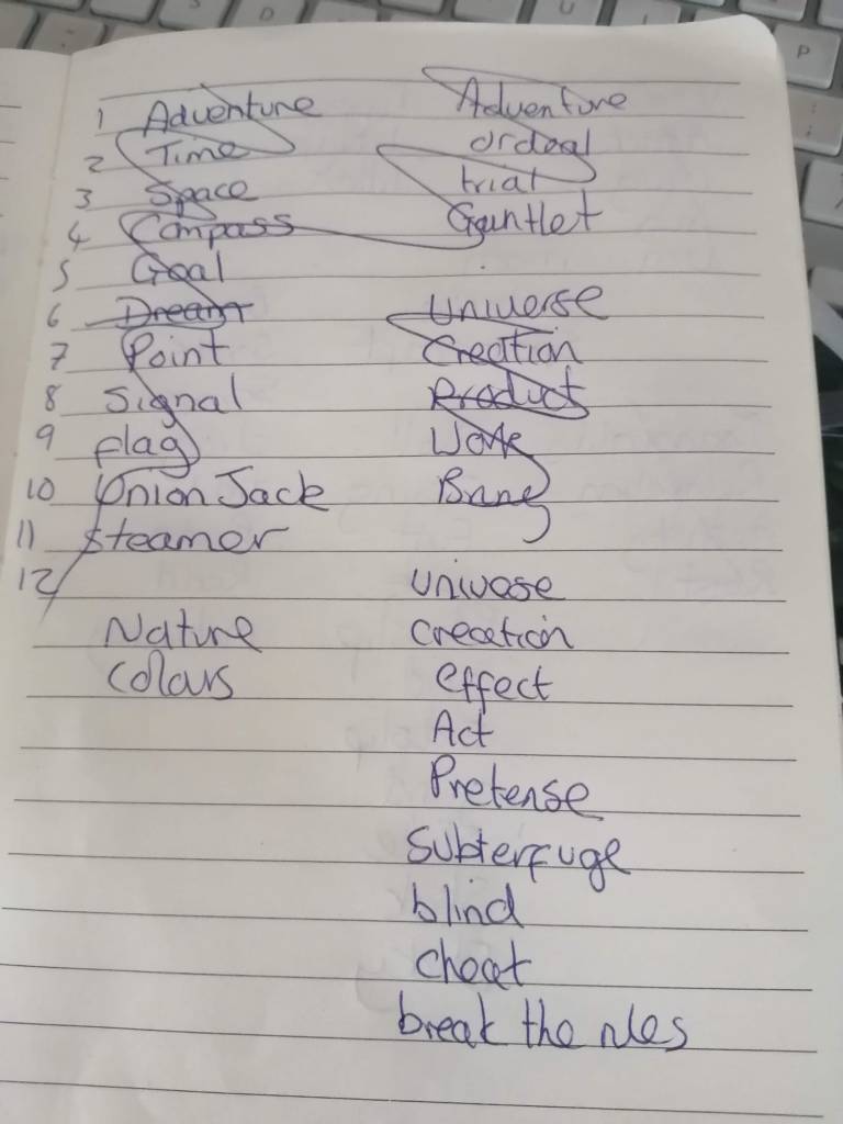
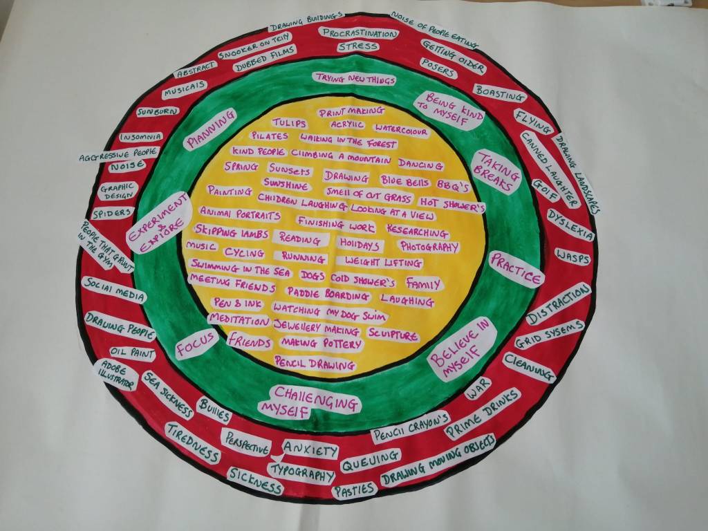
Categories
Research Points, Part Two: Being Creative

Research Task:​ Collage Approaches

Brief

To consider how collage and montage also influenced design and typography, you can access and read critic Simon Morley’s essay ‘Writing on the wall: word and image in modern art’ at the OCA library resource.

Look at the work of three of the artists referenced in this Collage & Montage section. You can search their names online, find them on Wikipedia or other websites, or look for their work on the OCA library resources. Here are some of them again with some others as well:

  •  Jean Arp
  •  Enrico Baj
  • Julie Cockburn
  • Max Ernst 
  • Linden Eller
  • Hannah Hoch
  • John Heartfield
  • Peter Kennard
  • Eugenia Loli
  •  Eduardo Paolozzi 
  •  Jamie Reid
  •  Linder Sterling
  • John Stezaker
  •  Isabel Reitemeyer 
  •  Martha Rosler
  • Annegret Soltau
  • Make notes about your thoughts on Morley’s essay and the different images that some of the artists use, how they incorporate them into pictures, and what the intention is behind the work. Consider these questions:
  • Where do they find the images that become part of their collages from? Which images do you find the most striking?
  • Do their images relate to the politics or social issues of their time? If not, what are they concerned with? Are they related to psychology, or dreams, or are they purely visual experiments? Discuss their relevance to the period they were made in.
  • Do the concerns of the images have a new relevance in today’s world, and if so, how?
Visual Skills 2: Visual Exploration p69.

Notes on Morley’s essay

Simon Morley examines the social and historical reasons that led to the rise of Constructivism as a reaction to the Dada and Futurist movements in his essay ‘Writing on the Wall: Word and Image in Modern Art’ (Morley, 2003). He discusses how artists have used written words or text in their visual works and how they combine a variety of artistic movements, techniques, and mediums in their work.

The essay investigates how artists have adapted to society in which words are used and play an important role in communication and culture. Morley investigates the cultural and social conditions that influence artists’ choices. A study of the magazine of the Paris-based Purist movement, L’Esprit Nouveau demonstrates this by comparing pieces of text, one handwritten and one typewritten.
The typewriter was perceived as a sign of order and progress in opposition to the turmoil and disappointment that followed World War I, and it was heavily impacted by the movements of Futurism and Dada.

Throughout history, various art trends have impacted the art world and how we see and use art today. The Futurist movement, for example, had an impact on art in the early twentieth century. It was distinguished by a heavy emphasis on the modern era, technology, and speed, as well as a rejection of tradition and history as it was thought of as outdated.

Futurist art often depicted motion and energy. An example of an artist who practised this is Giacomo Balla with his oil painting Dynamism of a Dog on a Leash which was completed in 1912.

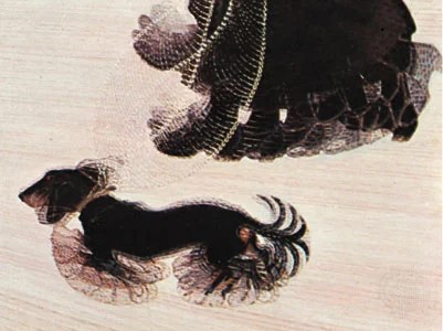
Fig 1. Dynamism of a Dog on a Leash (2012)

The people of this movement wanted to celebrate the modern world of industry and technology and did this using Neo Impressionism and Cubism.

During World War One, another movement known as Dada emerged out of anger and resentment for the war’s bloodshed and tragedy. Its goal was to question social norms and create artwork that would shock, people, such as satirical art.

Another growing movement during this time is constructivism. The people behind this movement wished to develop a new visual and verbal language that could be used by everyone. This form of art was associated with significant advances in machine mass manufacturing, and they believed in using logical design and technology to advance and better both art and society. El Lissitzky was one of the painters that contributed to the popularity of this movement.This style of art consisted of strong lines, high contrast in colour, and simple composition.

Morley explores the ways in which mass media has shaped and modified creative approaches. For example, industry, politics, and technology were all part of the constructivist theory. There was advancement in technology during the later 1920’s for example, the media-printing revolution, advancements in Radio, photography, film and lithograph.

All of these movements amongst a few others have had a lasting impact on art and design we see today. Especially Constructivism. Modern artists and designers can still be seen to practice some of the principles from these past movements. Such as, artist who are still exploring the use of basic shapes, lines, and colours in their work. For example, Georgia Nassikas is a modern day artist who creates art using mixed media and uses geometric shapes.

Below is one of her artworks created with wax and oil paint.

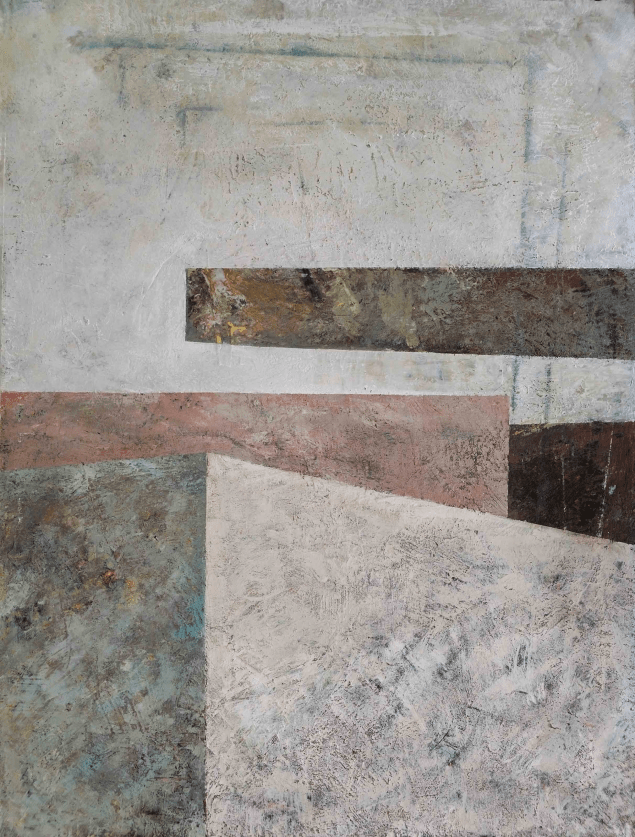
Fig. 2 Around (2016)

Many artists and designers use minimalism in their work today, and they continue to experiment with new materials and technology to express themselves. In conclusion, the influence of Constructivism can still be seen today in the continuous investigation of abstraction, geometric forms, and the use of modern materials. Its concepts continue to inspire artists who want to push the boundaries of creativity and engage with the changing environment around them.

Julie Cockburn

Julie Cockburn is a sculpture and a British Visual Artist known for turning old photographs into three dimensional objects.

Where does the artists get their images from? and what images do I find most striking?

Cockburn finds inspiration in a variety of places, including old family photos, vintage postcards, junk shops, and the internet. She will make several changes to these photographs, including cutting, sewing, and painting. Julie creates new and unexpected narratives in this manner, which the audience can interpret in their own way.

There are several images of hers that I find striking because of her excellent and bold use of colour that enhances the visual impact of her work. Cockburn’s use of colour triggers a wide range of emotions in audiences, from nostalgia from the use of an old photograph to surprise and excitement from the geographical shapes and pops of colour.

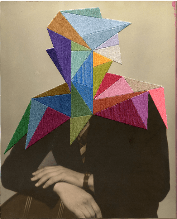
Fig. 3 Armour (2019)

I like the way this image provokes the viewers to think about who is behind the embroidery. The colour and transformation gives an old nostalgic photograph a new meaning.

What are the images related to?

Julie Cockburn’s artworks are based on themes such as memory, as evidenced by the usage of vintage postcards. Another topic emphasised is how she gives a feeling of personality to still portrait photographs, giving them a new life. Another theme in her art is transformation, which is shown through the use of embellishments and accentuating depth to a two dimensional image. Her subjects that she focuses on are specific – men, women, landscape and still lives.

Relevance in todays world

Julie’s work is relevant today because it invites the audience to contemplate and discuss the pieces, making their own interpretation of the work. What is now a digital age and currently a world concerned for the environment it is refreshing to see an artist using recycled materials and handcrafting them into something beautiful.

Linden Eller

Linden Eller is a mixed media artist who uses a variety of materials such as a variety of papers, tracing paper, found fragments, sewing thread, paint and pastels.

Where does the artists get their images from? and what images do I find most striking?

Often her work features recycled materials such as old paintings and book pages that she collects from thrift stores.

Although I enjoyed looking at all of her artwork I particularly liked her series of paintings entitled Rhythms of Motherbaby. I think this is because I probably felt a deeper connection to these works being a mother myself and how she may have felt while creating them.

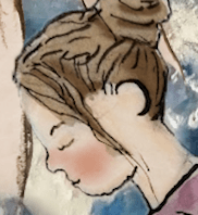
Below is one of these paintings from the series entitled ‘Sleep’

Fig. 4 Sleep (2022)

What are the images related to?

Linden created these paintings shortly after the birth of her son after being inspired by a book she bought called ‘A Life’s Work’ by Rachel Cusk. The paintings show the transition into motherhood and the connection felt with the new growing child.

Linden’s artwork in general is created with a pale colour palette and a mixture of different collected materials. When finished the work expresses her memory, childhood, longing, home and architecture. The work explores creatively how memories are processed, altered, and renewed.

Relevance in today’s world

Linden’s art work is relevant in today’s world not only because she is producing multimedia art during modern times but because her artwork addresses timeless subjects that resonate with modern audiences. Such as the work shown above. Her work is experimental and playful and often explores the human mind and our emotions which in todays era I think is very important especially with the turmoil people have faced with Covid and the Wars going on around the globe.

John Heartfield

John Heartfield was a Germaan photomonatage artist that produced artwork to fight against Nazism and fascism by using political satire.

Where does the artists get their images from? and what images do I find most striking?

John Heartfield, obtained images from magazines and newspapers such as AIZ (Arbeiter-Illustrierte-Zeitung). He would use some of these images to create his photomontages. Sometimes he would take his own photographs to use in his photomontages and also use found images in advertising materials, posters.

Another way he obtained images was by working with other artists such as George Grosz and Rudolf Schlichter, who provided him with some of the images he used in his photomontages.

Heartfield occasionally used official propaganda materials, particularly those created by the Nazi regime, to and critique the government’s messaging. He repurposed these materials to create satirical and critical works.

By recreating image from various sources, John Heartfield was able to craft visually striking and politically charged photomontages that had a significant impact on politics and artists during his time. His work is still celebrated for its powerful commentary on the socio-political events of the early 20th century.

The images I found most striking is ‘”The Meaning of Geneva.” or commonly known as ‘A Puppet in Thyssen’s Hand!) Due to copywriter issues I am unable to post a picture on this site. However it can be accessed at the link below.

This image was created during Hitler’s rise to power in the run-up to World War II. It implies that Hitler was a tool in the hands of more powerful people, such as the Nazi party, who manipulated and supported his rise to power. The depiction of Hitler as a puppet implies that he is not an individual leader but is rather controlled by the Nazi regime. It’s an intriguing piece of work that, sadly, could be remade today for example Donald Trump as the puppet and the Russians pulling his strings. Or Belarusian President Alexander Lukashenko, pulling Vladimir Putin’s strings.

What are the images related to?

His images are related to the Dada movement, political activism,
 and satire. As previously mentioned Heartfield used photomontage to confront Hitler and his enforcers. He attempted to raise social and political awareness while also criticising Hitler’s regime. Shockingly, I discovered Heartfield was number five on Hitler’s most wanted list, and Hitler sent his law enforcers to vandalise his art studio and attempted to murder Heartfield. Luckily John managed to hide and, fortunately, escape. I find it amazing he used his artwork to make an incredible change to peoples lives and that he risked his own life while doing it.

Relevance in todays world

John Heartfield’s artworks continue to be as powerful now as they were in the 1930’s for several reasons. With each of his photomontages he has managed to create a visual record of political and social issues that were happening during his time. I feel it is important for people to study his work and be able to understand the tragedy’s that happened during his time. By studying his work it can remind us to fight against dictatorship, promote social justice, and to keep using art as a medium for activism and change.

Reference list

David, E. (2019). Telling it Slant: Julie Cockburn’s Intricate Visual Language Challenges How We Perceive Each Other | Yatzer. [online] http://www.yatzer.com. Available at: https://www.yatzer.com/julie-cockburn-telling-it-slant [Accessed 11 Nov. 2023].

Eller, L. (2022). Rhythms of Motherbaby. [online] Linden Eller Studio. Available at: https://www.lindeneller.com/work/rhythms-of-motherbaby [Accessed 11 Nov. 2023].

hear field, J. (n.d.). John Heartfield Art As A Weapon Part One. [online] http://www.youtube.com. Available at: https://youtu.be/Af8r0g7Jw9k [Accessed 11 Nov. 2023].

Heartfield, J. (2023). Political Art. Official John Heartfield Exhibition. Integrity. Courage. Genius. [online] John Heartfield Exhibition. Available at: https://www.johnheartfield.com/John-Heartfield-Exhibition/.

Jones, J. (2019). Dynamism of a Dog on a Leash | Work by Balla. In: Encyclopædia Britannica. [online] Available at: https://www.britannica.com/topic/Dynamism-of-a-Dog-on-a-Leash.

Post, K. (2023). EXPLAINED: Who are Russia’s Allies? A List of Countries Supporting the Kremlin’s Invasion of Ukraine. [online] Get the Latest Ukraine News Today – KyivPost. Available at: https://www.kyivpost.com/post/13208.

Rise Art. (n.d.). Georgia Nassikas, Artist | Contemporary Art for Sale. [online] Available at: https://www.riseart.com/artist/64482/georgia-nassikas [Accessed 11 Nov. 2023].

Spicer, E. (2019). Julie Cockburn – interview: ‘My Work Is about Telling the truth, but in a Really Circuitous Way’. [online] http://www.studiointernational.com. Available at: https://www.studiointernational.com/julie-cockburn-interview-telling-it-slant-flowers-gallery-kingsland-road-london.

Tate (2014). El Lissitzky 1890-1941 | Tate. [online] Tate. Available at: https://www.tate.org.uk/art/artists/el-lissitzky-1519.

Tate (2017). Futurism – Art Term | Tate. [online] Tate. Available at: https://www.tate.org.uk/art/art-terms/f/futurism.

The Art Story (2016). Theo Van Doesburg. [online] The Art Story. Available at: https://www.theartstory.org/artist/van-doesburg-theo/.

Wikipedia Contributors (2019). L’Esprit Nouveau. [online] Wikipedia. Available at: https://en.wikipedia.org/wiki/L.

http://www.getty.edu. (n.d.). Agitated Images (Getty Center Exhibitions). [online] Available at: https://www.getty.edu/art/exhibitions/heartfield/.

http://www.lomography.com. (2015). Lomography – an Interview with Julie Cockburn. [online] Available at: https://www.lomography.com/magazine/313332-an-interview-with-julie-cockburn [Accessed 11 Nov. 2023].

Illustration list

Figure 1. Dynamism of a Dog on a Leash (2012) [Oil painting] At: https://en.wikipedia.org/wiki/Dynamism_of_a_Dog_on_a_Leash (Accessed on 31.10.23)

Figure 2. Around (2016) [Mixed media] At: https://www.riseart.com/art/73959/around-by-georgia-nassikas (Accessed on 31.10.23) 

Figure 3. Armour (2019) [Hand embroidery and ink on found photograph] At: https://www.studiointernational.com/julie-cockburn-interview-telling-it-slant-flowers-gallery-kingsland-road-london ( Accessed on 31.10.23)

Figure 4. Sleep (2022) [Mixed media] At: https://www.lindeneller.com/work/rhythms-of-motherbaby (Accessed on 31.10.23)

Categories
Coursework Part Two: Visual Approaches

Exercise 5:​ Word Processing

Brief

For this exercise you need to have access to a computer with Microsoft Word or a similar word processing programme with a thesaurus (if not you could use a standard dictionary for this exercise but it will take longer). In Word the Thesaurus is the second option in the ‘Tools’ drop-down box. The starting point for this exercise is an automated word association game.

Here is an example of how to play the word association exercises.

●  Choose a word to examine – the example here is the word ‘grass’ as a starting point. Type the word ‘grass’ in a new Word document.

●  When you highlight and look up ‘grass’ in the thesaurus you are given the alternative words ‘sward’, ‘grassland’, and then the third definition of grass which is the word ‘meadow’. Now type that word in after ‘grass’:grass meadow

● If you then look up ‘meadow’ on the thesaurus then ‘lea’ is the third alternative word, making:

grass meadow lea

● After continuing this process of looking up and adding the third alternative word for a while, you will eventually develop a word poem like this:

grass meadow lea grassland heath hill mountain elevation boost lift buzz tinkle phone headset phone mobile transportable travel collapsible foldaway folding foldaway

● After a while you will reach a point where the alternative word begins to loop and repeat and you can’t take the exercise further. In this case you could switch to the fourth alternative word, or the fifth if you then start repeating again.

Now think of your own word and try the experiment. ​Sometimes you might begin to repeat very quickly, but experiment with a few words until you achieve a list you find interesting.

Once you have reached a 20-30 word text or ‘poem’, draw pictures or take photographs of each of the words in the sequence. These can be quick sketches or snapshots, but keep the order the same as the ‘poem’. These don’t have to be perfect drawings or photographs, more a visual record of the text, maybe structured as a comic strip or storyboard. Here is an example of the ‘grass’ poem:

OCA Visual skills 2 – P57

I began typing words into Word but found it quite frustrating as each word wouldn’t generate enough new words to make the word poem.

Below are images of words I attempted.

Eventually I found a word that worked and this was Ocean.

This word poem is:

  • Ocean
  • Waves
  • Gesture
  • Signal
  • Beam
  • Smile
  • Twinkle
  • Shine
  • Glow
  • Flush
  • Burn
  • Smoke
  • Cigarette
  • Chore
  • Duty
  • Task
  • Assignmment
  • Charge
  • Impose
  • Con

Below are the individual illustrations I created for the poem.

Ocean & Waves

For these words, I painted an image of the ocean with crashing waves. This was created with acrylic paint.

Gesture

For this word, I decided to create a gesture drawing.

Signal

For this word, I created a flag which is a signal to say there is a danger of strong currents.

Beam

For this word, I used Adobe Photoshop to add a beam of light to the sea painting.

Smile

For this word, I created an illustration of a man smiling using pen and water colour paints. Then I enhanced the illustration using Adobe Photoshop using various brushes and the smudge tool.

Twinkle & shine

For these words, I added shine and twinkles to different parts of the sea painting using various brushes in Adobe Photoshop. Below is an example of part of the painting.

Glow

For this word, I added the sun to the painting and creating a warm glow using Adobe Photoshop.

Flush

For this word, I drew a lady looking flushed using a dip pen with black Indian Ink and watercolour then enhanced the illustration using Adobe Photoshop.

Burn, smoke & Cigarette

For the words burn and cigarette, I created an illustration of a lit cigarette and then added smoke using brush tools and blurring the marks using Photoshop.

Duty

For this word, I drew an illustration of a sign warning the public that there is no lifeguard on duty.

Chore , Task & Assignment

For these words, as they were very similar I decided to think about them as one and drew an illustration of a lady litter picking.

Charge

This was my favourite word of all them because I got to draw my pet dog charging towards me. The illustration was first drawn and painted with acrylic paint.

Then using a reference photo of him shown below, I then enhanced and added further detail to the drawing using Photoshop.

Impose

For this word, I painted a picture using acrylic paint of a sign imposing no alcohol.

Con

For this word I decided to create an illustration of a con artist. This particular con artist is an individual who tries to trick people into believing or investing in something that is not what it appears to be. Such as selling fake designer goods to tourists on the beach.

I like to think the illustration serves as a creative way to highlight the issue and remind people to be cautious when encountering such situations while traveling.

This illustration was created with pen and water colour and enhanced using Photoshop to add detail to the face and skin using various size brushes and the smudge tool.

All the individual illustrations I compiled into a final illustration which can be seen below.

Final illustration

Reflection

This task took me longer than I expected, partly because I made some images in great detail. I knew it wasn’t necessary for the exercise, but I wanted to challenge myself and see what I could come up with.

Generating images for each word was challenging to begin with. However, the more I thought about it, the more I could envision an interesting final illustration.

Putting all of the various sketches together helped me to create one cohesive artwork that visually tells a story. For example, combining the con artist’s illustrations generates a visually appealing  image.

This exercise enabled me to put complicated ideas into one single image. The final illustration allowed me to express an idea while also displaying my artistic creativity. I hope it engages viewers and provokes thought and emotion.

Categories
Part Two: Visual Approaches Research & Reflection Research Points, Part Two: Being Creative

Research Task:​ Process Artists

Brief

Many fine artists have developed systems and processes to create their work, and these approaches often cross boundaries between drawing, painting, sculpture and photography. Some famous ones are:

  • Robert Morris
  • Mario Merz
  • Agnes Martin
  •  Bruce Nauman
  • Eva Hesse
  • Overall, Joseph Kosuth’s working process is characterized by a rigorous commitment to conceptualism, an emphasis on intellectual engagement, and a careful consideration of language and its relationship to art. His work challenges viewers to think deeply about the nature of art and language, making it a significant and influential part of the conceptual art movement.

Research some of these artists’ work and working processes and reflect on these in your learning log.

OCA text book- Visual skills 2- Visual Exploration

Robert Morris

Robert Morris (1931-2018) was an American artist known for contributions to minimalist and post-minimalist art movements. His work consisted of many forms, dance performance, minimalist sculpture, earthworks, drawing, painting, film, photography, collage, readymades and theoretical essays.

In his works, Morris frequently used industrial materials such as plywood, fibreglass, aluminium, steel and felt. These were used to make simplified geometric forms.

Robert Morris’s Process with Sculpture.

While researching his approaches and focusing on some of his sculptures, I realised that his most famous works appeared in the middle of the 1960s, and Morris had a unique approach to this medium that began with minimalism. He would distance himself from his artwork while working in order to concentrate on the process of creation. which he continually highlighted as a significant component of his work. He once quoted:

“There’s information and there’s the object; there’s the sensing of it; there’s the thinking that connects to process,” he once explained. “It’s on different levels. And I like using those different levels.”

(Morris, 1960, as cited in The Art Story, 1915).

Morris appears to be discussing a process of engaging with and understanding the object he is constructing.

There is a distinction, for example, between what the artwork is about and what it shows. During his working process, Morris would investigate the artwork using his five senses.

Morris then goes through a cognitive process in which he reflects on, analyses, and interprets the artwork. When employing this working style, it is important to distinguish between each of the cognitive processes because it is this way that helps him to have a better understanding of his work.

Mario Merz

Mario Merz (1925-2003) was an Italian artist who was part of the Arte Povera movement which began in Italy in the late 1960s.

Following WWII, the fast development of industrialisation and advanced technology in Italy (and Europe) prompted the country’s transition to modernism. Other movements welcomed the modern age, but Arte Povera saw it as a threat. Mario Merz and other artists rebelled by frequently creating work from cheap-to-hand materials like mud, rags, glass, neon lights and twigs. This creative process is intended to push the boundaries of art in the modern day.

Merz’s work frequently incorporated these everyday objects to create sculptures, installations, and paintings that addressed topics of nature, culture, and society. His artistic process used a mix of mathematics, geometry, and the natural world.

I found it interesting that he frequently used the Fibonacci sequence in his work. This is a mathematical sequence found in nature. This influence can be seen in the image shown below where he has used spirals and numerical patterns.

Fig 1 – Fibonacci Tables (1974-1976)

One of Merz’s most iconic works is his igloo series. From the 1960’s until his death, he made thirty of these sculptures. These igloos are made from various materials, including clay, glass, and metal, and again they often incorporate the Fibonacci sequence in their construction. The use of the igloo symbolises the idea of shelter and the interconnectedness of human beings and nature.

Merz’s artwork also included political and social satire.  Merz once phrased on one of his sculptures “If the enemy masses his forces, he loses ground; if he scatters, he loses strength,” The phrase prompts viewers to think about Giáp (who was the general of the Peoples Army of Vietnam.), and other Vietnamese’ conduct throughout the Vietnam War, which had been going on for over a decade when Merz produced this sculpture. At the same time, the sculpture encourages viewers to think about their behaviours in the present day by engaging with the object. He was a critic of modern society’s excesses, and his art frequently attempted to question it. So he could promote a more environmentally friendly and peaceful interaction between humans and the environment.

Fig 2 – Igloo di Giap (1968)

Overall, Mario Merz’s creative technique was defined by the combination of mathematics, nature, and everyday materials and an in-depth study of humanity.

Joseph Kosuth

Joseph Kosuth is an American conceptual artist best known for his investigation of language and philosophy through visual art. He has made numerous contributions to the conceptual art movement that started in the 1960s and has continued to create thought-provoking art throughout his career.

His working process involves research, careful selection of language and texts, and careful consideration of the context in which his artworks will be shown.

Neon text installations are one of Kosuth’s most renowned types of art. He displays words, phrases, or quotes in neon lights, frequently in a language or script other than the viewer’s, encouraging people to consider the meaning of the words. He often displays definitions or lists of synonyms to investigate how language affects our views of reality and objects.

Below are some examples of his work

Overall, Joseph Kosuth’s working process is characterized by creating conceptual art, which focuses on engaging the viewer with careful thought about the language he uses and its relationship to the artwork.

Reflections

It was interesting to learn about these artists because they are not the type of artists I generally study. It was fascinating to learn about the purpose behind each artist’s work, their creative process, and how intellectually perceptive some of the pieces are once you know what they are about. Overall, all these three artists employ a minimalist approach, carefully selecting and analysing their medium and artwork.

It’s great to see how different artists begin their work, how they decide when a piece is finished, and what they hope to achieve.

Reference list

Auz, Dr.L. (2021). Mario Merz, Giap’s Igloo. [online] Smarthistory. Available at: https://smarthistory.org/merz-giap-igloo [Accessed 7 Sep. 2023].

king, N. (2010). OpenAthens / Sign in. [online] go-gale-com.ucreative.idm.oclc.org. Available at: https://go-gale-com.ucreative.idm.oclc.org/ps/i.do?p=ITOF&u=ucca&id=GALE%7CA460761404&v=2.1&it=r&sid=summon [Accessed 7 Sep. 2023].

Leonie Huber (2019). Robert Morris – Refractions – Berlin. [online] Sprüth Magers. Available at: https://spruethmagers.com/exhibitions/robert-morris-refractions-berlin/ [Accessed 2 Sep. 2023].

Merz, M. (1974). Fibonacci Tables. [Charcoal, Acrylic paint, Metallic Paint and Neon on Canvas] Tate Gallery online. Available at: https://www.tate.org.uk/art/artworks/merz-fibonacci-tables-t03673 [Accessed 6 Sep. 2023].

Rajesh, P. (2020). Mario Merz. ProQuest, [online] Jan., pp.100–101. Available at: https://www.proquest.com/docview/2328344975?accountid=14178&parentSessionId=%2FWUXklpy%2Bx7r4RQqy08ROLctM03Lj2mi%2Fzar4NlSuGg%3D&pq-origsite=summon [Accessed 7 Sep. 2023].

The Art Story (2015). Minimalism Movement Overview. [online] The Art Story. Available at: https://www.theartstory.org/movement/minimalism/.

Wikipedia Contributors (2018). Võ Nguyên Giáp. [online] Wikipedia. Available at: https://en.wikipedia.org/wiki/V.

Witney musem (n.d.). Robert Morris. [online] Sprüth Magers. Available at: https://spruethmagers.com/artists/robert-morris/.

Zelazko, A. (2023). Joseph Kosuth | Biography, Conceptual Art, Artworks, One and Three Chairs, & Facts. [online] Encyclopedia Britannica. Available at: https://www.britannica.com/biography/Joseph-Kosuth.‌

Illustration list:

Figure 1. Fibonacci Tables (1974-1976) [Painting] At:https://www.tate.org.uk/art/artworks/merz-fibonacci-tables-t03673 (Accessed on 06.09.23)

Figure 2. Igloo di Giap (1968 ) [Sculpture] At:https://smarthistory.org/merz-giap-igloo/ (Accessed on 07.09.23)

Categories
Part Two: Visual Approaches

Exercise 4:​ Word Associations

Brief

Undertake a series of mind-maps or spider diagrams to generate associations based on a single concept. Try and develop a process that moves your thinking through the obvious, to find more subtle, subjective, specific, or unusual motifs.

  1. Use a mind-map or spider diagram to generate associations based on one of the following concepts:● CUTTING ● GROW ● HIDE ● SEED ● WOBBLE or another concept that relates to your current practice: Place the word in the centre and radiate your ideas outwards.
  2. Try introducing images to your map or diagram as a way of offering new possibilities and ideas. Use quick drawings or snapshots as a way to do this on your spider-diagram, or move to your sketchbook to develop ideas further.
  3. Introduce new ideas to your map or diagram to help broaden your associations, for example, thinking about the sound, smell, touch, or movement of your concept/ideas as much as their image. Think about how you can use lateral thinking techniques as further prompts.
  4. Identify concepts/ideas in your spider diagram that you feel are the furthest or most divergent from your starting point. Amend or start a new diagram that aims to find connections between these divergent ideas and your original starting point. Alternatively, add new words or ideas, alongside your original and start to develop a more complex, rhizomatic set of connections. New words could include:● HISTORIC ● OVERLOOKED
    ● MUNDANE ● EXTRAORDINARY
  5. Identify which single idea/concept or lines of connections you feel have possibilities or are the richest in terms of how you might start developing a visual piece of work in response.

Use your learning log to identify these and reflect on the process and the exercise as a whole.

Visual Skills 2 – Visual Exploration – OCA

Keywords from the brief:

  • Use a series of mind maps or spider diagrams to generate associations based on a single concept.
  • Introduce images to the mind maps.
  • Use lateral thinking techniques as further prompts
  • Identify a concept from these spider diagrams that has the best possibility for starting a visual piece.

A series of mind maps or spider diagrams

To start this exercise, I made spider diagrams for each of the mentioned words to see what ideas I could come up with for each topic.

Cutting

The first word to investigate was cutting. Initial thoughts included cutting the grass, cutting hair, and cutting a piece of cake. However, when I thought about each new idea, I found myself deviating from the initial notion and coming up with some quite distinct thoughts such as self-harm, mental health, mystery, and pampered pets.

Grow

The second topic to look into was grow. Again, I began with simple terms like “growing older,” “growing taller,” and “growing seeds.” These ideas, however, produced some unusual concepts such as wizards, horror, and special powers.

Hide

The third theme was hide. This was a little more difficult for me to think of words at first, yet I soon got terms like hide and seek, hide from the enemy, and protect. This sparked three ideas for future projects: Boogeyman, Robber, and a comic strip depicting the realities of joining the military against the parents’ perspective. This final project idea probably came to me because my son is planning to enlist in the Royal Air Force.

Seed

The fourth topic was seed. This was my least favourite notion, and I had the most difficulty coming up with fresh words for it. Each of the words was self-explanatory, such as sow, grow, and harvest. God, COVID, and Mad were the most far from my starting point for the word seed. However, when compared to the earlier spider diagrams, I didn’t believe these were viable ideas for a new project.

Wobble

Wobble was the final word to be investigated. This word inspired the most ideas for me. I started out with words like teeth, jelly, scared, and unstable. However, the more I brainstormed, the more bizarre concepts I came up with, such as mermaids, bears, fairies, wizards, and Medusa, which surprised me.

Using images within the mind-maps.

I tried to incorporate little thumbnail sketches of what I was thinking about in each spider diagram; the more I did it, the easier it became. As shown in the diagram above, sketching out concepts helped me produce more ideas.

Looking at each of the spider diagrams side by side I looked at what I thought would be the most interesting words to use as a starting point for a new project and circled them in pink.

The ideas I liked the most were:

  • Caves/bears
  • Tooth Fairy
  • Mermaids
  • Pirates
  • Medusa
  • Boogeyman
  • Wizard

Looking over the list, I was amazed to discover that I had thought about fantasy characters for each spider diagram. However, being happy in children’s illustration is what I hope to achieve in the future, and I believe I’m on the right path to achieve this.

I wanted to play with each of the concepts right away, so I chose Wizard to experiment with just for fun.


First, I made a new spider diagram based on this topic.

After thinking how I could distinguish a traditional wizard from a standard drawing of one. I imagined what a modern-day wizard would look like. Especially if he was a young man. I didn’t want to make the mistake of recreating Harry Potter’s appearance (glasses, robe, and wand). Using Pinterest, I created a mood board with ideas for a young wizard.

As this was only for enjoyment and not for a final assignment, I figured it would be a good opportunity to learn some digital skills. I’ve attempted to draw digital illustrations a few times, but because I lack the necessary skills, the drawings never turn out as I would like.

This time I watched a Skill-share class to try and learn some new skills and I then applied it to my own drawing. The class I watched is called:

Digital painting : Fantasy illustration step by step tutorial.

By Ariya Abeen

Following along with the classes and techniques but using my own inspiration I began by starting my illustration with a few thumbnail ideas.

Next, I chose the bottom right thumbnail idea to work on as my new illustration.

Selecting the brush tool in Adobe Photoshop I sketched out a more detailed drawing of the young wizard. I wanted him to be young and trendy so dressed him in a hoody, skater gloves, baggy trousers and Converse trainers.

Next, I started to colour the illustration again using the brush tool.

Then I began adding further detail and started to add the background.

I continued to add detail to the background, including shadows and highlights, after receiving colour guidance from the Skillshare class, and I added a magical element to the artwork that the young wizard is conjuring.

Reflection.

This was a fun activity that turned out to be a surprisingly useful tool. It has allowed me to come up with new and intriguing project ideas that I would not have thought of otherwise. It was fascinating to observe how brainstorming may eventually transform my initial ideas into something altogether different.

It was enjoyable to experiment with digital painting and to gain new skills, but I am disappointed that I still have a lot to learn in this area. Due to my lack of technical understanding in this field, it will take some time for me to make a digital drawing that I am proud of. However, I will continue to practise this whenever possible.

I am also excited to come back to the list of fantasy characters and experiment with other mediums to illustrate soon.

Categories
Part Two: Visual Approaches

Exercise 3:​ Words to Pictures

Brief

For this exercise I was asked to choose a word and make a list of the different manifestations that the word can take.

Here are some keywords describing concepts:

  • PAINTING
  • WRITING
  • SOUND
  • DESIGNING
  • MAKING

Next, I was asked to visualise this written list by drawing thumbnail sketches of each of the words and phrases.

Once I have made a collection of sketches I have been asked to incorporate some or all of them into one A2-size image.

Keywords from the brief

  • Choose one of these words and make a written list of the different manifestations that the word can take
  • Draw thumbnail sketches of each of the words and phrases of your own list.
  • Observational studies of objects or people
  • Incorporate some or all of the sketches into one A2-size image.
  • Redraw or collage copies of your drawings
  • Organise your icons into a design, or cut up and combine copies of your photographs
  • Reflect on the process and the exercise.

Written list

As I was not sure which word to choose, I began the exercise by making lists for each of the words.

From all the words, the most interesting lists came from the words sound and making. I finally choose the word making.

Thumbnail sketches

Below are my thumbnail sketch ideas for each of the sentences.

Observational studies

Visual experimentation

Next, I selected some of the sketches and experimented roughly what they may look like when used together to form a new illustration. Below are these ideas.

The final sketch reminded me of a day when everything becomes too much for me. For example, having too many decisions to make and too many errands to run while juggling family life. It seemed to have a story to it, so I decided to recreate the drawing into a complete image.

I started by redrawing the thumbnail sketches into more proportioned characters and painting them in watercolour.

The illustration was then modified in Photoshop by making the image have more vivid colours and adding shadow and shade.

Final illustration

Reflection

To begin with, I thought this exercise was a little random and didn’t see the value of drawing random scenarios. However, after sketching thumbnails, I realised how it opened up my thought process and led me to interesting concepts. It’s a creative practise that could come in handy if I ever get stuck illustrating for a project and don’t know where to start.
I felt relieved after finishing the final illustration. Reflecting on it I thought It captured me on a day when I felt overwhelmed because I didn’t know where to start with a project and I enjoyed the illustration I created of my beloved dog Cody since I thought it portrayed his likeness beautifully.

After completing a project’s final illustration, I frequently examine whether it could be used productively in the future for another venture. After staring at the artwork for a while, I decided it would be amusing to use it as the front cover of a notepad for my academic work. To remind me to avoid procrastinating and get things done.
This was a fun exercise that I may repeat in the future.
Below is a mock-up of the note pad.

Image by Freepik -llustration by Author

Reference List

Mock-up of notepad (no date). Freepik. Available at: https://www.freepik.com/free-psd/back-school-template-with-notebook_1293559.htm.

Categories
Research & Reflection

Self-Assessment on my Assessment Results

Upon receiving my assessment results, I feel it is important to reflect on my performance and progress as an illustrator. I will use this self-assessment to identify my strengths and areas for improvement.

Strengths

I learned to identify subject boundaries and apply practical knowledge in the unit: Responding to a Brief. Being able to select, test, and interpret a wide range of focused research shows how I am committed to thoroughness and diligence.

My capacity to produce successful ideas by mixing creativity and critical thought was complimented in the assessment. This has boosted my self-esteem. I must remember to keep these skills in my practice because they allow me to deliver innovative solutions and insights to a wide range of projects and issues.

It was exciting to learn that I had improved my practical, technical, and communication abilities, as these are valuable advantages in any field because they allow you to not only produce ideas but also effectively communicate them to others.

Continuing to develop these skills will surely provide me with more opportunities to succeed in my studies and expand my practice. In the future, I must remember to be curious, dedicated to learning, and to continue pushing the boundaries of my knowledge and talents in order to achieve even greater advancement.

Areas for improvement

In my illustrations I need to check that there is enough contrast in tone, or colour, or line between what is in the foreground and what is in the background and explore more ways of being creative.

Ideas I could explore and help enhance my creativity are listed below.

  1. Experiment with Colour.
  2. Utilise Value and Tone effectively.
  3. Experiment with Lines and Shapes more.
  4. Consider Texture in exercises and assignments.
  5. Emphasise Lighting and Shadows where appropriate.
  6. Use Negative Space effectively.
  7. Play with Size and Scale before settling on a final outcome.
  8. Continue to combine Traditional and Digital Techniques.
  9. Improve my digital skill through courses and practice.
  10. Look for inspiration from other artists and designers.

Conclusion

The assessment results have given me valuable insights into my strengths and areas that need I can see need improvement. Over all I need to stop feeling afraid and to try new approaches and explore various possibilities. To keep pushing the boundaries of my creativity. Through self-awareness, dedication, and continuous learning, I am confident that I can take my illustration skills to new heights. Embracing challenges and seeking feedback will be important in my journey to becoming a more accomplished illustrator.

Categories
Research & Reflection Research Points, Part Two: Being Creative

Research Task:​ Visual Dynamics

Brief

The Open College of the Arts asked me to read an essay entitled ‘Point, Line, Plane’. Written by graphic designers Ellen Lupton and Jennifer Cole Phillips. In this blog, I have made notes on the essay.

Essay Reflection

“Point, line, and plane are the building blocks of design. From these elements, designers create images, icons, textures, patterns, diagrams, animations, and typographic systems.”

(Phillips, 2014)

The quote above is from an essay ‘Point, Line, Plane​’.

You can access the essay from the OCA Library here:

http://ebookcentral.proquest.com/lib/ucreative-ebooks/detail.action?docID=4518455 

The author goes into considerable detail regarding the ideas of point, line, plane, space, and volume, as well as drawing with code. It was intriguing to discover ways of using points in a drawing depending on where they are positioned and how they might link to their surroundings. Points can have hardly any value to a drawing or be extremely valuable. (Phillips, 2014) The description of each topic has given me more insight into how to use point, line, plane, space, and volume more effectively in the future. It was helpful to see drawings and photographs with visual examples of every concept. 

At the end of the chapter, there were two projects that challenged students to consider new ideas. I thought this may be helpful for me in the future, so have made notes on the exercises and I have written them up into short briefs for me to complete in the future.

Exercise 1: Three objects, thirty-three ways

Brief

  • Observe, represent, and abstract visible objects using a variety of materials and techniques.
  • Visit an unusual place with surprising things to see and observe, such as a local museum, aquarium, or botanical garden.
  • Produce observational drawings of three objects, pay special attention to the appearance of form, colour, texture, and materials.
  • Create a word lists and drawing from memory create ninety-nine studies.

Exercise 2: Spatial translation

Brief

  • Chose a space to observe it from multiple points of view.
  • Observe it from multiple psychological points of view.
  • Produce images using diverse media and mediums.
  • In your images, you may be representational, literal, abstract, iconic, indexical or symbolic.
  • finally, create a series of representations using dot stickers, tape, and cut paper.
  • Using the previous observations create a sequence of ten images suitable for an accordion fold book.

Reflection

Reading the book extract has taught me that patience, observation, and perseverance are key assets to being a creative designer, and I hope that finishing the two briefs from the book will help enhance my own skills. Unfortunately, I know I lack patience and find it difficult to draw random objects without a goal, but the knowledge gained from this research activity has provided me with an objective to aim for. By completing these briefs, I will be able to measure my progress and watch how my sketching skills change.

References

Phillips, J. C. (2014) ‘Point, Line, Plane’, in Graphic Design: The New Basics. New York, NY, USA: Princeton Architectural Press, pp. 33–47; 15 pages.

Categories
Coursework Part Two: Visual Approaches

Exercise 2:​ Multi-Dimensional Thinking

Brief

This exercise should take you a couple of hours to complete. As with Assignment One ‘Flow & Play’, begin with a blank sheet of A2 paper. Start by making random dots across the paper with the point of a pen or pencil, as if you are creating an elaborate dot-to-dot picture. Once you have filled the page with a couple of hundred dots, begin to connect them to make shapes and forms like squares, triangles and rectangles. As you begin to fill the page, think of how to connect these shapes to each other. Start to think three-dimensionally and in round and non-linear shapes, as if you are designing a landscape, or a city or park. Slowly start to think visually’ perhaps a cluster of dots resemble a tree, or a building, or a person. From your map of points, try to create the territory within that map.

Keywords from the brief

  • Couple of hours to complete.
  • A2 paper.
  • Start by making random dots across the paper
  • Begin to connect them to make shapes and forms like squares, triangles and rectangles.
  • Think visually’ perhaps a cluster of dots resemble a tree, or a building, or a person.
  • Try to create the territory within that map.

I started by making dots with a black fine liner pen, on an A2 piece of paper as directed. When the paper had over two hundred dots, I sat back and looked at it. I was initially a little lost and believed that I could only draw squares and triangles. Yet, after connecting a few of the dots, I noticed the beginnings of an image, so I kept on with the visual form emerging. It shocked me to see how much my drawing matched Charlie, my late dog. I kept adding forms to the drawing that would fit the narrative, such as a ball, trees, houses, and grass.

Below is the finished drawing.

After I scanned it into Adobe Photoshop and added basic colouring to see what it would look like.

This exercise has taken me by surprise and made me wander how and why I drew my dog that passed away last year.

I now recognise that this is yet another excellent activity to perform, perhaps when I am lacking project ideas.

Categories
Coursework Part Two: Visual Approaches

Exercise 1: ​Getting Into ‘The Zones’

Brief

Take an A1 (59 x 84cm) sheet of paper and draw a circle about 30cm in the middle of the sheet. Write inside the circle a list of things you like, experiences you enjoy or feel comfortable with. For example, these could be ‘sunshine’, ‘cities’, ‘lying in bed’ or ‘green salads’. Now draw two larger circles 40cm and 50cm diameter around the first circle, as if you are drawing a dartboard. Now in the large circle write things you don’t like and that stress you. These might be the opposites (or ‘antonyms’) of the things in the centre like ‘moonlight’, ‘the countryside’, ‘exercise’ or ‘bacon sandwiches’, but they also might be completely different things. Try to be as expansive as possible, so name experiences, objects, cultural phenomena, etc. Do you dislike all the things in the outer circle, or are they simply the opposites of the things in the centre?

After you have completed this exercise, reflect on your current creative practice and begin to identify what new things you’d like to develop through this course. Below are a series of prompts to help you, feel free to select which questions are most useful or add new questions of your own:

●  What do you feel comfortable doing?

●  What do you feel uncomfortable doing?

●  What areas would you like to develop further?

●  What thoughts do you have about your work and where it might develop?

●  Where would you like to begin?

●  How can you develop ways of working that allows for the new to emerge?

●  How are you going to document and reflect on your progress?

Write your responses to these questions and upload them to your learning log.

Keywords from the brief

  • Draw a circle about 30cm in the middle of the sheet. Write inside the circle a list of things you like, experiences you enjoy or feel comfortable with.
  • Draw two larger circles 40cm and 50cm diameter around the first circle, as if you are drawing a dartboard.
  • In the large circle, write things you don’t like and that stress you.
  • Be as expansive as possible,
  • Reflect on your current creative practice and begin to identify what new things you’d like to develop through this course.

I began by drawing three circles in pencil on an A1 sheet of paper. After that, I coloured each circle a different colour. My danger zone is represented in red, my maximum performance zone in green, and my comfort zone in yellow. I know it wasn’t essential, but colouring them helped me visualise my ideas better.

I began writing everything I am happy and comfortable doing on another piece of paper. Then I wrote down anything that makes me nervous, caused me concern, or caused me stress. After that, I cut up all the text and put them in the appropriate circles.

As the green circle became empty, I began to consider what I had written in both the comfort and risk zone. While reflecting, I recognised areas in my working practises that, if maintained, will allow me to perform better. So I wrote these ideas down and put them in the green zone.

Below is a photo of the finished work.

Fig 1: Comfort zone (2023)

Prior to beginning this exercise, there was some information in the OCA textbook that described flow and play, as well as a psychologist named Mihaly Csikszentmihalyi, who explains ‘flow’ as a mental state also known as getting into the zone. (Csikszentmihalyi, 1990). As a result, I did more study and viewed an amazing short film that illustrates the concept of flow. This is shown below. (Flow by Mihaly Csikszentmihalyi animated book, 2015)

Below is a screenshot from the video that helped me understand how I can get into a flow state.

Fig 2 : Screenshot of a flow model (2015)

I then watched a TED Talk by Mihaly Csikszentmihalyi, which is presented here.

He explains what the state of mind can be during an activity and what causes our moods to change.(TED, 2008) The next diagram depicts this flow mode.

Fig 3: The FLOW Model (1997)

Reflecting on the comfort zone drawing I did I decided to see where some of my topics sit within a graph like the one above.

Flow / attention, enjoyment.

  • Reading
  • Running
  • Lifting a new personal best at the gym
  • Painting
  • Sculpture
  • Drawing
  • Learning new Photoshop techniques

Control / enjoyment, confident.

  • Printmaking
  • Planning
  • Pen and ink
  • Sketching
  • Thumbnail ideas
  • Spider diagrams.

Relaxation / confident.

  • Playing with my dogs
  • Walking
  • Cooking
  • Taking a bath
  • Meditation
  • Matching a sunset
  • Watching waves crash at the seaside.

Boredom / relaxed, depressed.

  • Being confined to a grid system when designing
  • Drawing detailed buildings
  • Same daily routine
  • Collage
  • Contour drawing
  • Studying a topic I am not interested in.
  • Distraction
  • Choosing the right typography
  • Designing my own typography

Apathy / distracted, depressed.

  • Watching television,
  • Scrolling social media.
  • Stoping my children arguing

Worry / stressed, distracted.

  • Not being good enough
  • Dyslexia
  • Procrastination
  • The white page
  • Juggling study with family commitments
  • Not experimenting enough
  • Time management.
  • Will I be a success or is this a waste of time?
  • Am I too old to start this?

Anxiety / alert, stressed.

  • Social situations
  • Presentations
  • Talking to a crowd
  • Adobe Illustrator
  • Pencil crayons
  • Oil painting
  • Abstract art
  • Drawing movement
  • Making mistakes

Arousal / Alert, focused.

  • Blogging
  • Researching
  • Discussing ideas with family and fellow students.

Putting my topics into flow model titles has helped me understand my working mindset. It has shown me I spend too much time worrying about doing the work and trying to create perfection. However, if I spent more time in the areas of control, arousal, and flow, it would help me produce more work and most likely work that is of a higher standard. I need to believe in myself more, which I can do if I push myself but not too hard.

Studying Csikszentmihalyi’s theory and completing the comfort zone diagram helped me identify what I’m comfortable with and areas I want to work on, like building confidence, trying new things, having fun, and enjoying the course. Checking in with the flow model to see if I’m directing myself in the right places is one of my future goals. An Adobe Illustrator course, a confidence-building course, and getting feedback on my work will all help me gain confidence in the near future.

By making sure I spend more time in the three areas of flow, arousal and control, I think I will see a new progression in the speed and quality of my work. This exercise has been an invaluable exercise for me and one that I will continue to use and reflect on with future work.

List of Illustration

Fig 1: Fowler, G. (2023) Comfort zone. [Painting] The author.

Fig 2: Flow model (2015) [YouTube, screenshot] At: https://www.youtube.com/watch?v=8h6IMYRoCZw (Accessed 28/06/2023).

Fig 3: Digital reproduction of  Mihaly Csikszentmihalyi’s FLOW Model. The FLOW model (1997), https://www.mindtools.com/a3u4xut/the-flow-model. Accessed 28/06/2023.

Bibliography

Csikszentmihalyi, M. (1990) Flow: The Psychology of Optimal Experience. New York, NY, USA: Harper & Row.

FightMediocrity (2015) FLOW BY MIHALY CSIKSZENTMIHALYI | ANIMATED BOOK SUMMARY. YouTube. Available at: https://youtu.be/8h6IMYRoCZw.

Flow theory: A deeper dive into flow states (no date) Teuxdeux.com. Available at: https://teuxdeux.com/blog/flow-theory-a-deeper-dive-into-flow-states (Accessed: 28 June 2023).

MindTools (no date) Mindtools.com. Available at: https://www.mindtools.com/a3u4xut/the-flow-model (Accessed: 28 June 2023).

Oppland, M. (2016) 8 traits of flow according to Mihaly CsikszentmihalyiPositivepsychology.com. Available at: https://positivepsychology.com/mihaly-csikszentmihalyi-father-of-flow/ (Accessed: 28 June 2023).

TED (2008) Mihaly Csikszentmihalyi: Flow, the secret to happiness. YouTube. Available at: https://www.youtube.com/watch?v=fXIeFJCqsPs&t=5s.

Categories
Reflection on tutor feedback

Reflection on tutor’s feedback


Assignment one

I was relieved to hear that my blog is simple to use, as this will make it easy for visitors to find and read my work.  

I said in part one that I struggle with managing my time, and getting some help from my tutor was great. My tutor advised me of the 888 principles, so I investigated this more (Kit.,2020). Planning eight hours of study, eight hours of ‘me time’, and eight hours of sleep will assist me in better managing my everyday life. I may not have the exact schedule, but it offers me something to plan for.  

My tutor also advised me to use a stopwatch for me to sit and study for a designated time such as an hour, so I did this as a test and it did stop me from being interrupted by social media, phone calls, or coffee breaks. She also suggests that I use a Gantt chart to visualise time I have available for each assignment. I researched it, but I also found a very user-friendly app called the Todolist. I have now added all of my upcoming tasks to this app. It is useful since I can now see the work I have to perform in the upcoming days, weeks, and months. To further help me keep organised, I have also created a computerised daily schedule. Both of these new strategies will make it easier for me to calculate how much time I have left to study. There is also a choice to add personal events to the daily schedule.    

My tutor has suggested a book to help with writing about art, (Barnet, 2014) which I will borrow from the library, and I was relieved to find that, despite my dyslexia, my written work is developing positively.

It was discouraging to learn that my citations were not correct. Every time I have written something from a source, I have ensured I included references. I was unaware, however, of the unreliability of Wikipedia and the Tate as research sources and that my format was incorrect. It was fortunate that my tutor pointed out that I was not properly referencing because she informed me that the university library offers a tutorial that would teach me how to do it correctly. 

It is interesting that my tutor said it might be time for me to launch a website; this is something I have been considering doing for a while. I currently have a digital portfolio that needs additional work still, but it is not a website. I have not felt prepared to do this because I have thought the only work I can show is what I have done during this degree. Reflecting on this issue it has made me realise I ought to be producing work that I enjoy doing in my leisure time, too. Now that I have a time management strategy in place, this will be simpler to do.   

The last assignment of part one helped my practice by allowing me to think differently about making mistakes and being more confident. Hopefully, I will remember to practise this skill throughout the rest of the course.

Overall, I have learned a lot from the work produced in part one of this course and can now go forward with new ideas and new strategies of working.   

Bibliography  

Barnet, S. (2014) A short guide to writing about art, global edition. 11th edn. London: Pearson Education. 

Kit., C. (2020) 8–8–8 Rule: Living a Balanced and Happy Life. Singapore: CKSPACE. Available at: https://youtu.be/hZizLOgrVBo